3 Introduction to the tidyverse
3.1 Introduction
In this workshop series, we will learn to manipulate and visualize real-world data using packages in the tidyverse.
You will learn how to:
- create an R project and import data from a file into R,
- create subsets of rows or columns from data frames using dplyr,
- select pieces of an object by indexing using element names or position,
- change your data frames between wide and narrow formats,
- create various types of graphics,
- modify the various features of a graphic, and
- save your graphic in various formats
This comprehensive introduction to the tidyverse workshop series is ideal for beginners but assumes some prior experience with R (such as that in our Introduction to R workshop).
3.1.1 Setup intructions
Please come to the workshop with your laptop set up with the required software and data files as described in our setup instructions.
3.1.2 Background
Please read Hallam SJ et al. 2017. Sci Data 4: 170158 “Monitoring microbial responses to ocean deoxygenation in a model oxygen minimum zone” to learn more about the data used in this workshop. You can also check out this short video showing how the sampling was done!
3.2 Data description
The data in this workshop were collected as part of an on-going oceanographic time series program in Saanich Inlet, a seasonally anoxic fjord on the East coast of Vancouver Island, British Columbia (Figure 3.1).
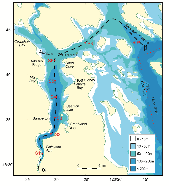
FIGURE 3.1: Map of Saanich Inlet indicating conventional sample collection stations (S1-S9). Data used in this workshop is sourced from S3.
Saanich Inlet is a steep sided fjord characterized by a shallow glacial sill located at the mouth of the inlet that restricts circulation in basin waters below 100 m (Figure 3.2).
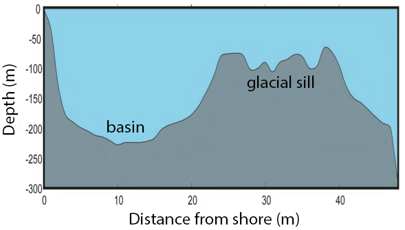
FIGURE 3.2: Structure of Saanich Inlet. The glacial sill restricts water circulation into and out of the lower depth of the inlet basin
During spring and summer months, elevated primary production (like photosynthesis) in surface waters combined with restricted circulation results in progressive water column stratification and complete oxygen starvation (anoxia) in deep basin waters. In late summer, pulses of oxygenated nutrient-rich ocean waters upwelling from the Haro Straight cascade over the sill, displacing oxygen starved bottom waters upward. The intensity of these renewal events varies from year to year with implications for microbial ecology and biogeochemical cycles (Figure 3.3).
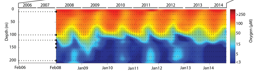
FIGURE 3.3: Contour plot of water column oxygen concentrations over multiple years in the time series. Warmer colors indicate high oxygen concentrations while cooler colors are low. Note the recurring pattern of oxygen decline below 100 m depth intervals followed by seasonal renewal events in late Summer into early Fall carrying more oxygenated waters into the Inlet.
The seasonal cycle of stratification and deep water renewal enables spatial and temporal profiling across a wide range of water column energy states and nutrients, thus making Saanich Inlet a model ecosystem for studying microbial community responses to ocean deoxygenation. Ocean deoxygenation is a widespread phenomenon currently increasing due to climate change.
The data we will use in this workshop include various geochemical measurements at many depths in Saanich Inlet. Samples were taken approximately monthly from 2006 to 2014, though there is much missing data to contend with.
For a brief introduction to the data used in this workshop series, see Hallam SJ et al. 2017. Sci Data 4: 170158 “Monitoring microbial responses to ocean deoxygenation in a model oxygen minimum zone”. More detailed information on the environmental context and time series data can be found in Torres-Beltrán M et al. 2017. Sci Data 4: 170159. “A compendium of geochemical information from the Saanich Inlet water column”.
3.3 Getting Started
3.3.1 Making an RStudio project
Projects allow you to divide your work into self-contained contexts.
Let’s create a project to work on.
In the top-right corner of your RStudio window, click the “Project: (None)” button to show the projects dropdown menu. Select “New Project…” > “New Directory” > “New Project.” Under the directory name, input “intro_tidyverse” and choose a parent directory to contain this project on your computer.
3.3.2 Installing and loading packages
At the beginning of every R script, you should have a dedicated space for loading R packages. R packages allow any R user to code reproducible functions and share them with the R community. Packages exist for anything ranging from microbial ecology to complex graphics to multivariate modelling and beyond.
In this workshop, we will use several packages within the tidyverse, particularly dplyr, tidyr, and ggplot2. Since these packages are used together so frequently, they can be downloaded and loaded into R all together as the “tidyverse”. We will also use the packages lubridate and cowplot.
Here, we load the necessary packages which must already be installed (see setup instructions for details).
3.4 Importing data withreadr
3.4.1 Reading spreadsheet data
In practice, reading in a text file with data in a spreadsheet is the most common method and this is the method we will be focusing on for the workshop. We will be using the readr package functions which is a part of the tidyverse for plain text files. As well, we will be using the readxl package functions for Microsoft Excel files. This package is part of the tidyverse, but it needs to explicitly loaded in addition to the tidyverse.
3.4.2 readr functions
Similarly to other tidyverse functions, the readr functions all have familiar syntax - as such, learning one will make learning the others easy. In this workshop, we will go over how to read in the most common files.
-
read_csv()reads in comma delimited files -
read_csv2()reads in semicolon delimited files. This is more common for places where commas are used as decimal place -
read_tsv()reads in tab delimited files -
read_delim()is the most flexible - it will work with any delimiter but you need to specify which one.
3.4.2.1 Using the read_csv() function
Let’s start by reading in the data we will use for this workshop. The first thing that we should do is to look at the raw data. From here we can match the correct function to import the data.
## # A tibble: 6 × 29
##   Longitude Latitude Cruise Date       Depth WS_O2   PO4    SI WS_NO3 Mean_NH4
##       <dbl>    <dbl>  <dbl> <date>     <dbl> <dbl> <dbl> <dbl>  <dbl>    <dbl>
## 1     -124.     48.6      1 2006-02-18 0.01     NA  2.42    NA   26.7       NA
## 2     -124.     48.6      1 2006-02-18 0.025    NA  2.11    NA   23.2       NA
## 3     -124.     48.6      1 2006-02-18 0.04     NA  2.14    NA   19.5       NA
## 4     -124.     48.6      1 2006-02-18 0.055    NA  2.49    NA   22.6       NA
## 5     -124.     48.6      1 2006-02-18 0.07     NA  2.24    NA   23.1       NA
## 6     -124.     48.6      1 2006-02-18 0.08     NA  2.80    NA   23.1       NA
## # … with 19 more variables: Std_NH4 <dbl>, Mean_NO2 <dbl>, Std_NO2 <dbl>,
## #   WS_H2S <dbl>, Std_H2S <dbl>, Cells.ml <dbl>, Mean_N2 <dbl>, Std_n2 <dbl>,
## #   Mean_O2 <dbl>, Std_o2 <dbl>, Mean_co2 <dbl>, Std_co2 <dbl>, Mean_N2O <dbl>,
## #   Std_N2O <dbl>, Mean_CH4 <dbl>, Std_CH4 <dbl>, Temperature <dbl>,
## #   Salinity <dbl>, Density <dbl>
read_csv() will use the the first line as the column name. Here let’s take a look at what happens if we read in a csv file without a title:
## # A tibble: 6 × 29
##   `-123.505` `48.59166667`   `1` `2006-02-18` `0.01` NA...6 `2.416` NA...8
##        <dbl>         <dbl> <dbl> <date>        <dbl>  <dbl>   <dbl>  <dbl>
## 1      -124.          48.6     1 2006-02-18    0.025     NA    2.11     NA
## 2      -124.          48.6     1 2006-02-18    0.04      NA    2.14     NA
## 3      -124.          48.6     1 2006-02-18    0.055     NA    2.49     NA
## 4      -124.          48.6     1 2006-02-18    0.07      NA    2.24     NA
## 5      -124.          48.6     1 2006-02-18    0.08      NA    2.80     NA
## 6      -124.          48.6     1 2006-02-18    0.09      NA    2.93     NA
## # … with 21 more variables: `26.703` <dbl>, NA...10 <dbl>, NA...11 <dbl>,
## #   NA...12 <dbl>, NA...13 <dbl>, NA...14 <dbl>, NA...15 <dbl>, NA...16 <dbl>,
## #   NA...17 <dbl>, NA...18 <dbl>, `212.028` <dbl>, NA...20 <dbl>,
## #   NA...21 <dbl>, NA...22 <dbl>, NA...23 <dbl>, NA...24 <dbl>,
## #   `123.024` <dbl>, NA...26 <dbl>, NA...27 <dbl>, NA...28 <dbl>, NA...29 <dbl>
3.4.2.2 Missing column names
If the data set does not contain a title, R will treat the first column as the title. We can usecol_names = FALSE to tell read_csv to not treat the first row as header. In this case, R will label it for us X1 - Xn:
## # A tibble: 6 × 29
##      X1    X2    X3 X4            X5    X6    X7    X8    X9   X10   X11   X12
##   <dbl> <dbl> <dbl> <date>     <dbl> <dbl> <dbl> <dbl> <dbl> <dbl> <dbl> <dbl>
## 1 -124.  48.6     1 2006-02-18 0.01     NA  2.42    NA  26.7    NA    NA    NA
## 2 -124.  48.6     1 2006-02-18 0.025    NA  2.11    NA  23.2    NA    NA    NA
## 3 -124.  48.6     1 2006-02-18 0.04     NA  2.14    NA  19.5    NA    NA    NA
## 4 -124.  48.6     1 2006-02-18 0.055    NA  2.49    NA  22.6    NA    NA    NA
## 5 -124.  48.6     1 2006-02-18 0.07     NA  2.24    NA  23.1    NA    NA    NA
## 6 -124.  48.6     1 2006-02-18 0.08     NA  2.80    NA  23.1    NA    NA    NA
## # … with 17 more variables: X13 <dbl>, X14 <dbl>, X15 <dbl>, X16 <dbl>,
## #   X17 <dbl>, X18 <dbl>, X19 <dbl>, X20 <dbl>, X21 <dbl>, X22 <dbl>,
## #   X23 <dbl>, X24 <dbl>, X25 <dbl>, X26 <dbl>, X27 <dbl>, X28 <dbl>, X29 <dbl>
Alternatively, we can pass a character vector into the col_names argument which will be used as the column names:
c_names <- c("Longitude", "Latitude,Cruise", "Date", "Depth", "WS_O2", "PO4", "SI", "WS_NO3", "Mean_NH4",
             "Std_NH4", "Mean_NO2", "Std_NO2", "WS_H2S", "Std_H2S", "Cells.ml", "Mean_N2", "Std_n2",
             "Mean_O2", "Std_o2", "Mean_co2", "Std_co2", "Mean_N2O", "Std_N2O", "Mean_CH4", "Std_CH4",
             "Temperature", "Salinity", "Density")

head(read_csv("data/saanich_data_title.csv", col_names = c_names))
## # A tibble: 6 × 29
## Longitude `Latitude,Cruise` Date Depth WS_O2 PO4 SI WS_NO3 Mean_NH4
## <dbl> <dbl> <dbl> <date> <dbl> <dbl> <dbl> <dbl> <dbl>
## 1 -124. 48.6 1 2006-02-18 0.01 NA 2.42 NA 26.7
## 2 -124. 48.6 1 2006-02-18 0.025 NA 2.11 NA 23.2
## 3 -124. 48.6 1 2006-02-18 0.04 NA 2.14 NA 19.5
## 4 -124. 48.6 1 2006-02-18 0.055 NA 2.49 NA 22.6
## 5 -124. 48.6 1 2006-02-18 0.07 NA 2.24 NA 23.1
## 6 -124. 48.6 1 2006-02-18 0.08 NA 2.80 NA 23.1
## # … with 20 more variables: Std_NH4 <dbl>, Mean_NO2 <dbl>, Std_NO2 <dbl>,
## # WS_H2S <dbl>, Std_H2S <dbl>, Cells.ml <dbl>, Mean_N2 <dbl>, Std_n2 <dbl>,
## # Mean_O2 <dbl>, Std_o2 <dbl>, Mean_co2 <dbl>, Std_co2 <dbl>, Mean_N2O <dbl>,
## # Std_N2O <dbl>, Mean_CH4 <dbl>, Std_CH4 <dbl>, Temperature <dbl>,
## # Salinity <dbl>, Density <dbl>, X29 <dbl>3.4.2.3 Metadata
Another thing to look for is “metadata”. Metadata is information about the data set. This can include how it was collected and other relevant information. This is typically at the top of the data file. If left alone, R will read in the metadata.
## # A tibble: 6 × 1
##   `This is an example of metadata.`
##   <chr>
## 1 Metadata provides information of the data set, typically it will include:
## 2 - file name
## 3 - type
## 4 - size
## 5 - creation date and time
## 6 - last modification date and time
To read in a file with metadata, we need to specify the amount of lines that we need to skip. That is why it is important to look at the file before starting!
## # A tibble: 6 × 29
##   Longitude Latitude Cruise Date       Depth WS_O2   PO4    SI WS_NO3 Mean_NH4
##       <dbl>    <dbl>  <dbl> <date>     <dbl> <dbl> <dbl> <dbl>  <dbl>    <dbl>
## 1     -124.     48.6      1 2006-02-18 0.01     NA  2.42    NA   26.7       NA
## 2     -124.     48.6      1 2006-02-18 0.025    NA  2.11    NA   23.2       NA
## 3     -124.     48.6      1 2006-02-18 0.04     NA  2.14    NA   19.5       NA
## 4     -124.     48.6      1 2006-02-18 0.055    NA  2.49    NA   22.6       NA
## 5     -124.     48.6      1 2006-02-18 0.07     NA  2.24    NA   23.1       NA
## 6     -124.     48.6      1 2006-02-18 0.08     NA  2.80    NA   23.1       NA
## # … with 19 more variables: Std_NH4 <dbl>, Mean_NO2 <dbl>, Std_NO2 <dbl>,
## #   WS_H2S <dbl>, Std_H2S <dbl>, Cells.ml <dbl>, Mean_N2 <dbl>, Std_n2 <dbl>,
## #   Mean_O2 <dbl>, Std_o2 <dbl>, Mean_co2 <dbl>, Std_co2 <dbl>, Mean_N2O <dbl>,
## #   Std_N2O <dbl>, Mean_CH4 <dbl>, Std_CH4 <dbl>, Temperature <dbl>,
## #   Salinity <dbl>, Density <dbl>
3.5 Data wrangling with dplyr
“Wrangling” is the process of manipulating and transforming “raw” data into a more accessible format that you can use for analysis or visualization.
As we did in the previous section, subsetting data frames and vectors in base R is an example of data wrangling. However, base R can quickly become confusing and convoluted. The tidyverse package dplyr provides an alternative syntax for data wrangling. It is so convenient and integrates with other popular tools like ggplot2 that it has rapidly become the de facto standard for data manipulation.
Compared to base R, dplyr code is very readable. Instead of base R’s indexing system (with its brackets and parentheses), which is difficult to read, dplyr operations are based around a small set of functions that match English-language “verbs.” The most common verbs are:
-
select()a subset of columns based on their names. -
filter()out a subset of rows based on their values. -
rename()columns. -
arrange()a column in ascending or descending order. -
mutate()all values of a column, i.e., add a new column that is a function of existing columns. -
group_by()a variable andsummarise()data by the grouped variable. -
*_join()two data frames into a single data frame.
Each verb works similarly:
- Input data frame as the first argument
- Other arguments refer to the columns that we want to manipulate
- The output is another data frame
3.5.1 select()
You can use the select() verb to focus on a subset of columns. For example, suppose we are only interested in the longitude and latitude of our geochemical observations. Then, we could subset the geochemicals data frame to include only the appropriate columns.
select(geochemicals, Longitude, Latitude)## # A tibble: 1,605 × 2
## Longitude Latitude
## <dbl> <dbl>
## 1 -124. 48.6
## 2 -124. 48.6
## 3 -124. 48.6
## 4 -124. 48.6
## 5 -124. 48.6
## 6 -124. 48.6
## 7 -124. 48.6
## 8 -124. 48.6
## 9 -124. 48.6
## 10 -124. 48.6
## # … with 1,595 more rowsIn the box below, subset the following columns from geochemicals:
- cruise number,
Cruise - date,
Date - depth in kilometers,
Depth - ammonium (NH\(_4\)) concentration,
Mean_NH4 - nitrogen dioxide (NO\(_2\)) concentration,
Mean_NO2 - dinitrogen (N\(_2\)) concentration,
Mean_N2 - oxygen (O\(_2\)) concentration,
Mean_O2 - carbon dioxide (CO\(_2\)) concentration,
Mean_co2 - nitrous oxide (N\(_2\)O) concentration,
Mean_N2O - methane (CH\(_4\)) concentration,
Mean_CH4
Now, what if we want to select many columns?
select(geochemicals, Cruise, Date, Depth, Mean_NH4, Mean_NO2,
       Mean_N2, Mean_O2, Mean_co2, Mean_N2O, Mean_CH4)
## # A tibble: 1,605 × 10
## Cruise Date Depth Mean_NH4 Mean_NO2 Mean_N2 Mean_O2 Mean_co2 Mean_N2O
## <dbl> <date> <dbl> <dbl> <dbl> <dbl> <dbl> <dbl> <dbl>
## 1 1 2006-02-18 0.01 NA NA NA 212. NA NA
## 2 1 2006-02-18 0.025 NA NA NA 218. NA NA
## 3 1 2006-02-18 0.04 NA NA NA 219. NA NA
## 4 1 2006-02-18 0.055 NA NA NA 204. NA NA
## 5 1 2006-02-18 0.07 NA NA NA 162. NA NA
## 6 1 2006-02-18 0.08 NA NA NA 136. NA NA
## 7 1 2006-02-18 0.09 NA NA NA 96.5 NA NA
## 8 1 2006-02-18 0.1 NA NA NA 51.1 NA NA
## 9 1 2006-02-18 0.112 NA NA NA 22.4 NA NA
## 10 1 2006-02-18 0.125 NA NA NA 5.03 NA NA
## # … with 1,595 more rows, and 1 more variable: Mean_CH4 <dbl>That was a lot of typing! It would be nice if we could select all of those columns without writing so much… In fact, there are several helper functions that can be used with select() to describe which column to keep:
-
starts_with("abc"): column names that start with"abc" -
ends_with("abc"): column names that end with"abc" -
contains("abc"): column names containing"abc"
We can create a new data frame named dat that contains the same geochemicals columns that you selected above — but this time, use the starts_with() helper function to quickly select all of the chemicals.
dat <- select(geochemicals,
              Cruise, Date, Depth,
              Temperature, Salinity, Density,
              starts_with("WS_"),
              starts_with("Mean_"))
head(dat)
## # A tibble: 6 × 16
## Cruise Date Depth Temperature Salinity Density WS_O2 WS_NO3 WS_H2S
## <dbl> <date> <dbl> <dbl> <dbl> <dbl> <dbl> <dbl> <dbl>
## 1 1 2006-02-18 0.01 NA NA NA NA 26.7 NA
## 2 1 2006-02-18 0.025 NA NA NA NA 23.2 NA
## 3 1 2006-02-18 0.04 NA NA NA NA 19.5 NA
## 4 1 2006-02-18 0.055 NA NA NA NA 22.6 NA
## 5 1 2006-02-18 0.07 NA NA NA NA 23.1 NA
## 6 1 2006-02-18 0.08 NA NA NA NA 23.1 NA
## # … with 7 more variables: Mean_NH4 <dbl>, Mean_NO2 <dbl>, Mean_N2 <dbl>,
## # Mean_O2 <dbl>, Mean_co2 <dbl>, Mean_N2O <dbl>, Mean_CH4 <dbl>We will use the dat data frame in the rest of the tutorial.
The full list of helper functions can be found by running ?select_helpers in
the console.
3.5.2 filter()
You can use filter() to subset particular rows based on a logical condition of a variable: instead of choosing (by index) which of the hundreds of rows to keep, we chose to keep only those rows that obey a specific condition: for example, we might want to keep only those observations taken at a depth of 100 m.
To define the logical condition, we use logical operators. Here are some examples of logical operators:
| R code | meaning |
|---|---|
== |
equals |
< or > |
less/greater than |
<= or >= |
less/greater than or equal to |
%in% |
in |
is.na |
is missing (NA) |
! |
not (e.g. not equal to !=; not missing !is.na()) |
& |
and |
| |
or |
Let’s get some practice with conditional statements before we move on to the filter function. Try to complete the following exercises:
Using the first 16 depth observations in the depth data in the R Script:
- Find the indices where depth is greater or equal to 0.055
- Check if the value 0.111 is in the depth data
- Find where depth is less than 0.060 OR depth is greater than 0.140
Check that your answers to these questions are:
- 3 FALSE, followed by 13 TRUE
- FALSE
- 4 TRUE, followed by 7 FALSE, followed by 5 TRUE
Now let’s try some concrete examples! The pre-populated code in the box filters dat such that we only retain data collected after February 2008 (i.e., such that the Date is greater than the 2008-02-01). Pay attention to the syntax: filter(<data_frame>, <logical_statement>).
## # A tibble: 6 × 16
##   Cruise Date       Depth Temperature Salinity Density WS_O2 WS_NO3 WS_H2S
##    <dbl> <date>     <dbl>       <dbl>    <dbl>   <dbl> <dbl>  <dbl>  <dbl>
## 1     18 2008-02-13 0.01         7.49     29.6    23.1  225.   18.9      0
## 2     18 2008-02-13 0.02         7.34     29.7    23.2  221.   24.0      0
## 3     18 2008-02-13 0.04         7.74     29.9    23.3  202.   29.2      0
## 4     18 2008-02-13 0.06         7.74     30.1    23.5  198.   24.0      0
## 5     18 2008-02-13 0.075        7.56     30.2    23.6  194.   23.8      0
## 6     18 2008-02-13 0.085        8.04     30.4    23.7  150.   23.0      0
## # … with 7 more variables: Mean_NH4 <dbl>, Mean_NO2 <dbl>, Mean_N2 <dbl>,
## #   Mean_O2 <dbl>, Mean_co2 <dbl>, Mean_N2O <dbl>, Mean_CH4 <dbl>
We can then modify the code so that it only retains the data points collected after February 2008 that were sampled depper than 100 m.
dat <- filter(dat, Date >= "2008-02-01" & Depth > 0.1)Logical operators in R are extremely powerful and allow us to filter the data in almost any way imaginable. The code below filters dat to obtain observations taken in the month of June. It does this using the function month() from the lubridate package, which takes in a date as an input and returns the month number as an output (e.g., month("2008-02-01") returns 2). Modify it to obtain observations taken in the month of June, after 2008, at depths of either 10 or 20, and where oxygen data is not missing.
## # A tibble: 0 × 16
## # … with 16 variables: Cruise <dbl>, Date <date>, Depth <dbl>,
## #   Temperature <dbl>, Salinity <dbl>, Density <dbl>, WS_O2 <dbl>,
## #   WS_NO3 <dbl>, WS_H2S <dbl>, Mean_NH4 <dbl>, Mean_NO2 <dbl>, Mean_N2 <dbl>,
## #   Mean_O2 <dbl>, Mean_co2 <dbl>, Mean_N2O <dbl>, Mean_CH4 <dbl>
This also brings up another best practice in data science. Dates are usually recorded as 1 string like year-month-day. This means we must use an additional package and function to subset by any of these values. In actuality, the best practice is to give year, month, and day in separate columns so that you could filter as filter(dat, month==6). But this is not the most common format so we are showing the lubridate workaround here.
3.5.2.1 Exercise: select and filter
Because we will be manipulating the data further, first copy the data dat to practice data pdat so that what you do in the exercises does not impact the rest of the workshop.
Using your pdat data:
- select the
Cruise,Date,Depth, andMean_O2variables - save the output into a new variable with a name of your choice
- filter the new data so as to retain data on Cruise 72 where Depth is smaller than or equal to 20 m.
3.5.3 rename()
You can use rename(<data_frame>, <new_name> = <old_name>) to assign new names to your columns. You can rename as many columns as you want at the same time. For example, we can remove the Mean_ prefix from some of the columns. Then, we can modify it so as to remove the prefix from the remaining chemicals (CO\(_2\), N\(_2\)O, and CH\(_4\)).
The rename() function can be very useful when your variable names are very long and tedious to type (contains white spaces and special symbols).
rename(dat,
       NH4 = Mean_NH4,
       NO2 = Mean_NO2,
       N2 = Mean_N2,
       O2 = Mean_O2,
       CO2 = Mean_co2,
       N2O = Mean_N2O,
       CH4 = Mean_CH4)
## # A tibble: 586 × 16
## Cruise Date Depth Temperature Salinity Density WS_O2 WS_NO3 WS_H2S
## <dbl> <date> <dbl> <dbl> <dbl> <dbl> <dbl> <dbl> <dbl>
## 1 18 2008-02-13 0.11 9.12 31.0 24.0 39.6 19.4 0
## 2 18 2008-02-13 0.12 9.42 31.2 24.1 9.64 14.7 0
## 3 18 2008-02-13 0.135 9.49 31.3 24.1 4.90 13.6 0
## 4 18 2008-02-13 0.15 9.49 31.3 24.2 4.38 9.83 0
## 5 18 2008-02-13 0.165 9.46 31.3 24.2 4.02 9.76 0
## 6 18 2008-02-13 0.185 9.44 31.3 24.2 3.79 11.5 0
## 7 18 2008-02-13 0.2 9.43 31.3 24.2 3.63 11.9 0
## 8 19 2008-03-19 0.11 8.99 31.0 24.0 39.1 24.0 0
## 9 19 2008-03-19 0.12 9.33 31.2 24.1 12.5 19.3 0
## 10 19 2008-03-19 0.135 9.46 31.3 24.1 4.35 14.9 0
## # … with 576 more rows, and 7 more variables: NH4 <dbl>, NO2 <dbl>, N2 <dbl>,
## # O2 <dbl>, CO2 <dbl>, N2O <dbl>, CH4 <dbl>
3.5.4 arrange()
Use arrange(x)
For example, we can arrange the data in the order of ascending NO3 values.
Use arrange(<data_frame>, <x>) to sort all the rows of a given <data_frame> by the value of the column <x> in ascending order. For example, we can arrange the data in the order of ascending CH4 values.
arrange(dat, Mean_CH4)## # A tibble: 586 × 16
## Cruise Date Depth Temperature Salinity Density WS_O2 WS_NO3 WS_H2S
## <dbl> <date> <dbl> <dbl> <dbl> <dbl> <dbl> <dbl> <dbl>
## 1 21 2008-05-14 0.135 9.09 31.2 24.1 27.9 14.9 0
## 2 21 2008-05-14 0.15 9.25 31.3 24.2 15.1 9.81 0
## 3 21 2008-05-14 0.165 9.33 31.3 24.2 5.59 3.47 0
## 4 25 2008-09-10 0.11 9.00 31.1 24.1 23.8 23.0 0
## 5 25 2008-09-10 0.12 9.07 31.2 24.1 20.1 21.1 0
## 6 25 2008-09-10 0.135 9.15 31.2 24.1 9.26 10.5 0
## 7 26 2008-10-15 0.15 9.26 31.3 24.2 14.5 15.1 0
## 8 26 2008-10-15 0.165 9.25 31.3 24.2 24.2 19.5 0
## 9 26 2008-10-15 0.185 9.24 31.3 24.2 28.9 20.4 6.55
## 10 26 2008-10-15 0.2 9.23 31.4 24.2 26.8 20.9 0
## # … with 576 more rows, and 7 more variables: Mean_NH4 <dbl>, Mean_NO2 <dbl>,
## # Mean_N2 <dbl>, Mean_O2 <dbl>, Mean_co2 <dbl>, Mean_N2O <dbl>,
## # Mean_CH4 <dbl>To sort rows in descending order, use arrange(<data_frame>, desc(<x>)). Here we can arrange dat in descending order of Mean_O2:
## # A tibble: 586 × 16
##    Cruise Date       Depth Temperature Salinity Density WS_O2 WS_NO3 WS_H2S
##     <dbl> <date>     <dbl>       <dbl>    <dbl>   <dbl> <dbl>  <dbl>  <dbl>
##  1     32 2009-04-08 0.11         8.19     30.9    24.0 68.9   26.9       0
##  2     33 2009-05-13 0.11         8.13     30.7    23.9 NA     26.7       0
##  3     21 2008-05-14 0.11         8.44     30.9    24.0 86.1   17.8       0
##  4     21 2008-05-14 0.12         8.70     31.0    24.1 65.1   20.3       0
##  5     31 2009-03-11 0.11         8.50     30.9    24.0 55.0   25.8       0
##  6     33 2009-05-13 0.12         8.29     30.8    23.9 NA     24.1       0
##  7     26 2008-10-15 0.165        9.25     31.3    24.2 24.2   19.5       0
##  8     29 2009-01-14 0.11         8.86     31.0    24.0 34.1   23.2       0
##  9     26 2008-10-15 0.11         9.21     31.2    24.1  5.93   7.03      0
## 10     33 2009-05-13 0.135        8.71     30.8    23.9 NA     18.5       0
## # … with 576 more rows, and 7 more variables: Mean_NH4 <dbl>, Mean_NO2 <dbl>,
## #   Mean_N2 <dbl>, Mean_O2 <dbl>, Mean_co2 <dbl>, Mean_N2O <dbl>,
## #   Mean_CH4 <dbl>
3.5.5 mutate()
Mutate is one of the most useful verbs in the dplyr package. Use mutate(data_frame, y = function(x)) to apply a transformation to some column x and assign the output to the column name y. The transformation can be a function (e.g., log(x)) or a mathematical operation. As an example, we can divide Depth by 1000 (converting its units from metres to kilometers) and assign the output to a new column, Depth_km.
mutate(dat, Depth_km = Depth/1000)## # A tibble: 586 × 17
## Cruise Date Depth Temperature Salinity Density WS_O2 WS_NO3 WS_H2S
## <dbl> <date> <dbl> <dbl> <dbl> <dbl> <dbl> <dbl> <dbl>
## 1 18 2008-02-13 0.11 9.12 31.0 24.0 39.6 19.4 0
## 2 18 2008-02-13 0.12 9.42 31.2 24.1 9.64 14.7 0
## 3 18 2008-02-13 0.135 9.49 31.3 24.1 4.90 13.6 0
## 4 18 2008-02-13 0.15 9.49 31.3 24.2 4.38 9.83 0
## 5 18 2008-02-13 0.165 9.46 31.3 24.2 4.02 9.76 0
## 6 18 2008-02-13 0.185 9.44 31.3 24.2 3.79 11.5 0
## 7 18 2008-02-13 0.2 9.43 31.3 24.2 3.63 11.9 0
## 8 19 2008-03-19 0.11 8.99 31.0 24.0 39.1 24.0 0
## 9 19 2008-03-19 0.12 9.33 31.2 24.1 12.5 19.3 0
## 10 19 2008-03-19 0.135 9.46 31.3 24.1 4.35 14.9 0
## # … with 576 more rows, and 8 more variables: Mean_NH4 <dbl>, Mean_NO2 <dbl>,
## # Mean_N2 <dbl>, Mean_O2 <dbl>, Mean_co2 <dbl>, Mean_N2O <dbl>,
## # Mean_CH4 <dbl>, Depth_km <dbl>We can also mutate multiple columns. We can create a new column containing the sum of Mean_O2 and Mean_CH4:
mutate(dat, O2_plus_CH4 = Mean_O2 + Mean_CH4)## # A tibble: 586 × 17
## Cruise Date Depth Temperature Salinity Density WS_O2 WS_NO3 WS_H2S
## <dbl> <date> <dbl> <dbl> <dbl> <dbl> <dbl> <dbl> <dbl>
## 1 18 2008-02-13 0.11 9.12 31.0 24.0 39.6 19.4 0
## 2 18 2008-02-13 0.12 9.42 31.2 24.1 9.64 14.7 0
## 3 18 2008-02-13 0.135 9.49 31.3 24.1 4.90 13.6 0
## 4 18 2008-02-13 0.15 9.49 31.3 24.2 4.38 9.83 0
## 5 18 2008-02-13 0.165 9.46 31.3 24.2 4.02 9.76 0
## 6 18 2008-02-13 0.185 9.44 31.3 24.2 3.79 11.5 0
## 7 18 2008-02-13 0.2 9.43 31.3 24.2 3.63 11.9 0
## 8 19 2008-03-19 0.11 8.99 31.0 24.0 39.1 24.0 0
## 9 19 2008-03-19 0.12 9.33 31.2 24.1 12.5 19.3 0
## 10 19 2008-03-19 0.135 9.46 31.3 24.1 4.35 14.9 0
## # … with 576 more rows, and 8 more variables: Mean_NH4 <dbl>, Mean_NO2 <dbl>,
## # Mean_N2 <dbl>, Mean_O2 <dbl>, Mean_co2 <dbl>, Mean_N2O <dbl>,
## # Mean_CH4 <dbl>, O2_plus_CH4 <dbl>
3.5.6 Piping with %>%
In the previous exercise, we had to perform quite a large series of data wrangling tasks. First, we selected some columns; then, we renamed them; then we filtered them; and finally we mutated one of the columns. The most natural way to think about this exercise is as a chain (or sequence) of functions: each dplyr verb wrangles the input data frame into a new (output) data frame, which is then provided as the input to the following verb. Metaphorically, the output of the first function is piped into the following function.
The tidyverse package magrittr introduced the %>% (pipe) operator, which uses this metaphor to make code easier to read:
f(x) %>% g(y) is the same as g(f(x),y)
select(dat, Cruise) is the same as dat %>% select(Cruise)
Piping works nicely to condense code and to improve readability. It integrates especially well with dplyr. Here is an example:
dat %>%
  select(Cruise, Date, Depth, Mean_CH4) %>%
  filter(Date >= "2008-02-01") %>%
  rename(CH4 = Mean_CH4) %>%
  mutate(log_CH4 = log(CH4)) %>%
  head()
## # A tibble: 6 × 5
## Cruise Date Depth CH4 log_CH4
## <dbl> <date> <dbl> <dbl> <dbl>
## 1 18 2008-02-13 0.11 5.97 1.79
## 2 18 2008-02-13 0.12 3.2 1.16
## 3 18 2008-02-13 0.135 13.9 2.63
## 4 18 2008-02-13 0.15 16.5 2.81
## 5 18 2008-02-13 0.165 19.8 2.98
## 6 18 2008-02-13 0.185 45.2 3.81
3.5.6.1 Piping with |>
This year (2021), R created |> as a built in operator! It was inspired from the pipe we just learned about from the magrittr package, which is imported by the tidyverse package. Which one should you use? Most of the time it will not matter!
dat |>
  select(Cruise, Date, Depth, Mean_CH4) |>
  filter(Date >= "2008-02-01") |>
  rename(CH4 = Mean_CH4) |>
  mutate(log_CH4 = log(CH4)) |>
  head()
## # A tibble: 6 × 5
## Cruise Date Depth CH4 log_CH4
## <dbl> <date> <dbl> <dbl> <dbl>
## 1 18 2008-02-13 0.11 5.97 1.79
## 2 18 2008-02-13 0.12 3.2 1.16
## 3 18 2008-02-13 0.135 13.9 2.63
## 4 18 2008-02-13 0.15 16.5 2.81
## 5 18 2008-02-13 0.165 19.8 2.98
## 6 18 2008-02-13 0.185 45.2 3.81
3.5.7 group_by() and summarise()
summarise() (or summarize()) is handy when we want to calculate summaries for groups of observations. This is done by first applying the group_by() verb and then feeding it into summarise(). For example, we can calculate the mean, standard deviation, and sample size of oxygen concentrations by depth as follows:
dat %>%
  group_by(Depth) %>%
  summarise(O2_mean = mean(Mean_O2, na.rm = TRUE),
            O2_sd = sd(Mean_O2, na.rm = TRUE),
            nr_observations = n())
## # A tibble: 14 × 4
## Depth O2_mean O2_sd nr_observations
## <dbl> <dbl> <dbl> <int>
## 1 0.11 55.6 32.1 83
## 2 0.12 28.5 22.2 83
## 3 0.125 NaN NA 1
## 4 0.13 NaN NA 1
## 5 0.135 16.1 12.3 83
## 6 0.14 NaN NA 1
## 7 0.15 14.1 9.41 83
## 8 0.16 NaN NA 1
## 9 0.165 13.6 14.7 82
## 10 0.17 NaN NA 1
## 11 0.18 NaN NA 1
## 12 0.185 13.4 10.3 82
## 13 0.19 NaN NA 1
## 14 0.2 12.9 13.2 83In the chain above, the function n() returns the number of rows corresponding to each depth and the argument na.rm = TRUE inside functions like mean() and sd() ensures that NA values are ignored when calculating those summary statistics.
3.6 Tidy data with tidyr
3.6.1 What is tidy data?
There are many ways that you could organize your data into a data frame format. For example, the following data (animation by Garrick Aden‑Buie):
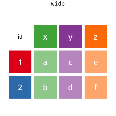
In these two data frames, the same information is organized differently. The former data frame is wide: a single variable (Year) takes up many columns. In contrast, the latter data frame is long: each column represents one variable.
All packages in the tidyverse work better with long data (or, as it is also known in the context of the tidyverse, “tidy” data). A data frame is tidy when: - each row is a single observation, - each variable is a single column, and - each value is a single cell.
Take a look at our current data set. Is it in long or wide form format? Is it tidy?
head(dat)## # A tibble: 6 × 16
## Cruise Date Depth Temperature Salinity Density WS_O2 WS_NO3 WS_H2S
## <dbl> <date> <dbl> <dbl> <dbl> <dbl> <dbl> <dbl> <dbl>
## 1 18 2008-02-13 0.11 9.12 31.0 24.0 39.6 19.4 0
## 2 18 2008-02-13 0.12 9.42 31.2 24.1 9.64 14.7 0
## 3 18 2008-02-13 0.135 9.49 31.3 24.1 4.90 13.6 0
## 4 18 2008-02-13 0.15 9.49 31.3 24.2 4.38 9.83 0
## 5 18 2008-02-13 0.165 9.46 31.3 24.2 4.02 9.76 0
## 6 18 2008-02-13 0.185 9.44 31.3 24.2 3.79 11.5 0
## # … with 7 more variables: Mean_NH4 <dbl>, Mean_NO2 <dbl>, Mean_N2 <dbl>,
## # Mean_O2 <dbl>, Mean_co2 <dbl>, Mean_N2O <dbl>, Mean_CH4 <dbl>The data frame dat would be long if each measurement were its own row. As it is, many different chemical concentrations appear in each row.
3.6.2 Long form data
We can turn data from wide to long, and vice versa, by “pivoting.” To turn dat into a longer data frame, we use pivot_longer(), a function from the tidyverse package tidyr. This function takes the following arguments:
- the data frame to be pivoted,
- a vector containing the columns that we want to combine into a single, longer column or the columns that we do not want to merge (indicated by a minus sign),
-
names_to: The name of the column that is created from the data stored in the current column names, and -
values_to: The column’s name to create from the data stored in cell values.
Here is pivot_longer() in action:
long_dat  <- dat %>%
  pivot_longer(-c(Cruise, Date, Depth),
               names_to = "Chemical",
               values_to = "Concentration")
head(long_dat)
## # A tibble: 6 × 5
## Cruise Date Depth Chemical Concentration
## <dbl> <date> <dbl> <chr> <dbl>
## 1 18 2008-02-13 0.11 Temperature 9.12
## 2 18 2008-02-13 0.11 Salinity 31.0
## 3 18 2008-02-13 0.11 Density 24.0
## 4 18 2008-02-13 0.11 WS_O2 39.6
## 5 18 2008-02-13 0.11 WS_NO3 19.4
## 6 18 2008-02-13 0.11 WS_H2S 03.6.3 Wide form data
We can undo this operation with the opposite function, pivot_wider(), which works similarly to its counterpart. The pivot_wider() function takes the following arguments:
- The data frame to be pivoted;
- A vector containing the columns that we want to pivot or the columns that we do not want to pivot (indicated by an exclamation point
!). If this argument is left blank, it defaults to all columns in the data frame except for those specified innames_fromandvalues_from; -
names_from: The name of the column whose elements provide the names of the output columns; -
values_from: The column’s name from which we get the values of the output columns.
We can use pivot_wider() to go back from the long data frame to the original:
wide_dat <- long_dat %>%
  pivot_wider(names_from = "Chemical",
              values_from = "Concentration")
head(wide_dat)
## # A tibble: 6 × 16
## Cruise Date Depth Temperature Salinity Density WS_O2 WS_NO3 WS_H2S
## <dbl> <date> <dbl> <dbl> <dbl> <dbl> <dbl> <dbl> <dbl>
## 1 18 2008-02-13 0.11 9.12 31.0 24.0 39.6 19.4 0
## 2 18 2008-02-13 0.12 9.42 31.2 24.1 9.64 14.7 0
## 3 18 2008-02-13 0.135 9.49 31.3 24.1 4.90 13.6 0
## 4 18 2008-02-13 0.15 9.49 31.3 24.2 4.38 9.83 0
## 5 18 2008-02-13 0.165 9.46 31.3 24.2 4.02 9.76 0
## 6 18 2008-02-13 0.185 9.44 31.3 24.2 3.79 11.5 0
## # … with 7 more variables: Mean_NH4 <dbl>, Mean_NO2 <dbl>, Mean_N2 <dbl>,
## # Mean_O2 <dbl>, Mean_co2 <dbl>, Mean_N2O <dbl>, Mean_CH4 <dbl>
3.7 Graphics with ggplot2
ggplot2 is an extremely popular tidyverse package that functions as an alternative to base R plotting. ggplot2 is a popular tool for data visualization because all ggplot2 graphics use the same logical principles. These principles are called the Grammar of Graphics, after a 1999 book by Leland Wilkinson.
Learning the grammar of graphics may appear challenging at first, and you may be tempted to resort instead to base R’s one-line plotting functions. However, the simplicity of base R graphics may be deceitful: while base R makes it easy to plot a scatterplot or histogram, it is hard to scale it up to more complex graphics. Each plot type has its names, conventions, data types, and syntax. In contrast, ggplot2 graphics take more lines to write, but they all use the same internal logic based on the grammar of graphics.
There is a lot to learn about ggplot2, and this tutorial will not cover all of it. If you want to learn more, be sure to read chapters 3 and 28 of Hadley Wickham’s book R for Data Science. For more in-depth information, check out Hadley Wickham’s book ggplot2: Elegant Graphics for Data Analysis. For a collection of recipes to solve common graphics problems, read Winson Chang’s The R Graphics Cookbook. All of these books are available online for free.
3.7.1 The Grammar of Graphics
The fundamental idea behind the grammar of graphics is that a graphic consists of some geometric objects (e.g., points, lines, bars) whose aesthetic attributes (e.g., size, shape, colour, position along the x- and y-axes) encode data.

FIGURE 3.4: A visual representation of the different layers for a ggplot graph.
To build a ggplot, you combine different elements (called “layers”), like building blocks. The three mandatory building blocks of a ggplot are:
- data: a data frame where each variable is one column
- aesthetics: map variables to visual attributes (e.g., position, colour)
- geoms: geometric objects that represent data (e.g., points, bars, lines)
In addition, there are also many optional layers, such as:
- stats: statistical transformations of data (e.g., binning, averaging, smoothing…)
- scales: control how to map a variable to an aesthetic, e.g., what colours to use
- facets: represent data as multiple plots, each for a subset of the data
- guides: axes, legend, etc. reflect the variables and their values
The idea is to independently specify and combine the layers to create the plot you want.
3.7.2 Your first ggplot
By creating a scatterplot, let’s examine the relationship between oxygen (Mean_O2) and carbon dioxide (Mean_co2) in the dat data frame.
With ggplot2, you begin a plot with the function ggplot(), creating a blank canvas to which you can add layers. To make a plot, you need at least three building blocks:
- The first argument of ggplot is the dataset. So we initiate our plot with
ggplot(dat)ordat %>% ggplot(). - The second argument is the aesthetic map. This argument is a function,
aes(), whose arguments specify the dataset’s variables (columns) and how they map onto the plot. In this case, the first variable (oxygen) will map into the x-axis, and the second variable (carbon dioxide) will map into the y-axis. Hence we writedat %>% ggplot(aes(x = Mean_O2, y = Mean_co2)). - You complete the graphic by adding one or more layers representing geometric objects, or “geoms.” These geometric objects represent our data. In this case, we will use
geom_point()because the data are represented as points. There are many geom functions for different types of data visualization, and we will learn some of them in this workshop.
Let’s put it all together and produce our first ggplot!
geochemicals %>%
  ggplot(aes(x = Mean_O2, y = Mean_co2)) +
  geom_point()
## Warning: Removed 1350 rows containing missing values (geom_point).
Note that the above R code has a warning. Warnings do not always indicate that there is an error in your code. For example, this warning tells us that there is missing data in our data frame, which we already know.
3.7.3 Aesthetics
What if we want to include all three variables (Mean_O2, Mean_co2, and Depth) in the same two-dimensional plot? We ran out of axes after x and y, but we can use other aesthetic mappings to represent other variables. Aesthetic mappings include things like the size, the shape, or the colour of your points.
For instance, we can use the points’ colour to represent depth.
geochemicals %>%
  ggplot(aes(x = Mean_O2, y = Mean_co2, colour = Depth)) +
  geom_point()
(The aes() function accepts both color and colour as correct argument names.)
We can also map a continuous variable by using differently sized points as an alternative to point colour.
geochemicals %>%
  ggplot(aes(x = Mean_O2, y = Mean_co2, size = Depth)) +
  geom_point()
We can also color points by a categorical variable. Using the long_dat data set we previously created, we will filter it so that it only contains oxygen and carbon dioxide. Then, we will plot the relationship between Concentration(in the x-axis) andDepth(in the y-axis), indicating theChemical` variable by point color:
long_dat %>%
  filter(Chemical %in% c("Mean_O2", "Mean_CO2")) %>%
  ggplot(aes(x = Concentration, y = Depth, color = Chemical)) +
  geom_point()
Another aesthetic mapping that is appropriate for categorical variables is point shape. We can modify the code we just ran so that Chemical is indicated by shape and colour. Lastly, we will reverse the direction of the y-axis to obtain the depth profile (i.e., so that the top of the water column is at the top of the plot) by adding a further layer: scale_y_reverse().
long_dat %>%
  filter(Chemical %in% c("Mean_O2", "Mean_CO2")) %>%
  ggplot(aes(x = Concentration, y = Depth, color = Chemical, shape = Chemical)) +
  geom_point() +
  scale_y_reverse()
3.7.3.1 Scales and aesthetics
The layer we just added, scale_y_reverse(), is not a geom layer but rather an example of a scale layer. The word “scale” here refers to the key that explains the mapping between a variable and the geometric object. A straightforward example of a scale is the colour legend: it describes the mapping between point colour and the values of the Chemicals variable. With its tick marks and labels, the axis line is also a scale: it explains the mapping between point location and the value of the Concentration variable.
Scale layers modify the rules of this mapping between geometry and variable (scale_y_reverse() reverses the order of the mapping). Many scale layers help you achieve more control over your mappings.
3.7.3.2 Decorative aesthetics
You can also set the aesthetic properties of your geom manually. Sometimes, we want the aesthetic properties to serve a merely decorative purpose. For instance, we may want to remake our original scatterplot relating O\(_2\) to CO\(_2\) but colour all points in red and larger size. Those aesthetic properties (colour and size) will not represent any variables if we decide to do so. Hence, they are not called inside the aes() function, but outside of it, as arguments to our geom layer. Study the code in the box below and run it:
geochemicals %>%
  ggplot(aes(x = Mean_O2, y = Mean_co2)) +
  geom_point(color = "red", size = 3)
Note that because size and colour are not aesthetic mappings in the plot above, ggplot does not create any associated colour or size scale.
See how some points overlap each other, especially on the left? Making points semi-transparent can help tell them apart. The aesthetic controlling transparency is called alpha, and it takes values ranging from zero (fully transparent) to one (fully opaque). Return to the previous box and add the argument alpha = 0.5 to geom_point(). Run the code to see the result.
3.7.4 Geoms
Take a look at the two plots below. What is similar about them, and what is different?
select(geochemicals, Cruise, Date, Depth, starts_with("Mean_")) %>%
  ggplot(aes(x = Mean_O2, y = Depth)) +
  geom_point()
select(geochemicals, Cruise, Date, Depth, starts_with("Mean_")) %>%
  ggplot(aes(x = Mean_O2, y = Depth)) +
  geom_smooth()
Both graphs are similar in that both describe the same variables (Mean_O2 and Depth) of the same data frame (dat). Furthermore, they both use the same aesthetic mapping (oxygen is mapped to the x-axis and depth to the y-axis).
But they are different because they use different geometric objects (“geoms”) to represent those data. The first graph uses points (geom_point()), whereas the second one uses a smooth curve (with confidence bands) fitted to the data (geom_smooth()). To go from the first plot to the second, you only need to change the geom.
This is what the grammar of graphics is all about: a language to describe what is fundamentally similar and different about different plots. Note that there is no reason why you should restrict yourself to a single geom. The code below produces a scatterplot with a smoothed curve to help guide the eye:
geochemicals %>%
  ggplot(aes(x = Mean_O2, y = Depth)) +
  geom_point() +
  geom_smooth()
Note:
Note: geom_smooth() is a convenient and versatile geom. You can use it to quickly plot linear regression models with confidence bands by calling geom_smooth(method = "lm").
3.7.4.1 Line plots
geom_line() connects observations in the order that they appear in the data. It is especially useful when plotting time series. The code below combines the point and line geoms to plot a time series of oxygen at a depth of 200 meters:
long_dat %>%
  filter(Depth == 0.2 & Chemical == "Mean_O2" & !is.na(Concentration)) %>%
  ggplot(aes(x = Date, y = Concentration)) +
  geom_point()  +
  geom_line()
3.7.4.2 Exercise: line plot
Using the previous code as a starting point, create a similar plot showing two lines (distinguished by colour): Mean_O2 and Mean_co2.
3.7.4.3 Histograms and distributions
The histogram geom helps visualize the distribution of a continuous variable. It accomplishes this by dividing the x-axis into bins and counting the number of observations in each bin. Because it shows the distribution of a single variable, it only requires one aesthetic (x).
The code below examines the distribution of Mean_O2 at depths less than 0.1. Then, modify it to compare the distribution of Mean_O2 at depths higher than or equal to 100.

This pattern makes sense as we know that oxygen is depleted as we go deeper in Saanich Inlet.
By default, geom_histogram() divides the x-axis evenly into 30 bins. You can divide the axis into a different number of bins by writing geom_histogram(bins = <number of bins>). You may have to play a little with this number to get a histogram capturing the distribution of your data. Try different numbers of bins in the plot above.
As an alternative to histograms, distributions can also be shown using density plots: geom_density(). The code below show the contrast of density distribution of Mean_O2 and Mean_CO2:
long_dat %>%
  filter(Chemical %in% c("Mean_O2", "Mean_CO2")) %>%
  ggplot(aes(x = Concentration, colour = Chemical)) +
  geom_density()
A good alternative to using colour = Chemical (which colours the outlines of the density distribution) is to use fill = Chemical (which colours the inside of the distribution). Try it out in the code box above. Combine it with some transparency (e.g., alpha = 0.5) in the density geom.
3.7.4.4 Boxplots and violin plots
All the plots we encountered so far map continuous variables to the x-axis. Boxplots (geom_boxplot()), in contrast, are ideal for categorical x-axis. Take a look at the code below to compare the Concentration of different chemicals in the Chemical column (namely: Mean_O2, and Mean_CO2).
long_dat %>%
  filter(Chemical %in% c("Mean_O2", "Mean_CO2")) %>%
  ggplot(aes(x = Chemical, y = Concentration)) +
  geom_boxplot()
We know from our previous plots that the oxygen concentration is higher at low depths, whereas the CO\(_2\) concentration is higher in deeper waters. We can show this by plotting a pair of boxplots for each chemical: one boxplot showing concentration below 100 meters, and the other showing concentration above 100 meters. Aesthetic mappings like fill or colour allow us to do this.
long_dat %>%
  filter(Chemical %in% c("Mean_O2", "Mean_CO2")) %>%
  ggplot(aes(x = Chemical, y = Concentration, fill = Depth < 0.1)) +
  geom_boxplot()
Note that Depth < 100 is not a column of the data frame, but we can still use it as the aesthetic fill argument. Similarly we could also use something like sqrt(Concentration) as the aesthetic y argument (try it out!). We can use any transformation of an existing column as an aesthetic.
An alternative to the boxplot is the violin plot, which, rather than showing the quartiles of the data, shows its density distribution. Return to the code box above and replace geom_boxplot() with geom_violin() to see an example.
3.7.5 Facets
We learned that one way to add additional variables is with aesthetics. Another way is to split the graphic into panels, or “facets”: one facet for each level of a categorical variable. Use facet_wrap() to facet your plot by a single variable.
The code below was our depth profile plot (for simplicity, we filtered the dat to contain only data from Cruises 10 through 13). Now, imagine that we wanted to represent (in addition to O\(_2\) and CO\(_2\)) the concentrations of N\(_2\)O and NH\(_4\) as well. If we put all of that information into a single plot, it would become very crowded (you can try it out yourself). Instead of using the colour aesthetic to map Chemical, we can add the layer facet_wrap(vars(Chemical)) to separate the single depth profile into four depth profiles – one for each chemical.
long_dat %>%
  filter(Cruise %in% 18:30,
         Chemical %in% c("Mean_O2", "Mean_co2", "Mean_N2O", "Mean_NH4")) %>%
  ggplot(aes(x = Concentration, y = Depth, color = Chemical)) +
  geom_point() +
  scale_y_reverse() +
  facet_wrap(~Chemical)
You can also facet your plot on the combination of two variables. To do this, add the layer facet_grid() instead of facet_wrap(). The only other difference is that we now need to provide two instances of vars(), one for each variable name.
long_dat %>%
  filter(Cruise %in% 25:30,
         Chemical %in% c("Mean_O2", "Mean_co2")) %>%
  ggplot(aes(x = Concentration, y = Depth)) +
  geom_point() +
  scale_y_reverse() +
  facet_grid(vars(Cruise), vars(Chemical))
3.8 Fine-tuning your plot
So far, we have produced plots for data exploration. We didn’t care too much about how they looked. But when we create plots for communication (i.e., for slideshows, posters, or scientific articles), we need to make sure that they also look good.
In this section, we will work to create a beautiful multi-panel figure. Each panel will be based on a plot that we have produced so far. Panel A will show the negative correlation between O\(_2\) and CO\(_2\) concentration, and panel B will show paired boxplots for CO\(_2\) and O\(_2\) above and below 100 meters.
3.8.1 Labels
We can change the labels of the previous plot with the labs() function, specifying exactly what we want as the title, x-, and y-axis labels:
dat %>%
 ggplot(aes(x = Mean_O2, y = Mean_co2)) +
 geom_point(alpha = 0.7) +
 geom_smooth(method = "lm") +
 labs(x = "Oxygen concentration", y = "Carbon dioxide concentration",
      title = "Oxygen and carbon dioxide in the Saanich Inlet")
3.8.2 Scales (axes and legends)
The next thing to change is the scales, particularly in the boxplot panel. The fill scale labels (FALSE, TRUE) and the x scale labels (Mean_co2, Mean_O2) need to be changed. We do this using scale layers, and we already encountered one (scale_y_reverse()).
We will use two scale layers: scale_x_discrete() and scale_fill_discrete(). Note that scale layers always start with the prefix scale_, followed by the scale being modified (x, y, fill, colour, shape, size, etc.). In this case, we are modifying scales for categorical variables, hence the suffix _discrete(). Analogous layers for continuous variables end in _continuous().
long_dat %>%
  filter(Chemical %in% c("Mean_O2", "Mean_co2")) %>%
  ggplot(aes(x = Chemical, y = Concentration, colcor = Chemical, fill = Depth < 0.1)) +
  geom_boxplot() +
  labs(title = "Effect of depth", fill = "Depth") +
  scale_fill_discrete(labels = c("> 100 m", "< 100 m")) +
  scale_x_discrete(labels = c("Carbon dioxide", "Oxygen"))
3.8.3 Themes
By default, ggplot uses a characteristic gray colour scheme. We can choose to use a “classic” black and white theme and add it to a ggplot object. There are also many pre-made themes, and with some experience, you can also learn to create your own themes.
dat %>%
  ggplot(aes(x = Mean_O2, y = Mean_co2)) +
  geom_point(alpha = 0.7) +
  geom_smooth(method = "lm") +
  labs(x = "Oxygen concentration", y = "Carbon dioxide concentration",
       title = "Oxygen and carbon dioxide in the Saanich Inlet") +
  theme_classic()
3.8.4 Multi-panel figures
To create multi-panel figures, we can use the package cowplot. First, we assign each plot to a variable. For example, in the code below, we assigned the plots to the variables p1 and p2. Then, we use the cowplot function plot_grid() to create the multipanel figure. We use the labels argument for adding tags to our panels and the rel_widths argument to specify the relative width of each panel.
# create an object for the first plot
p1 <- dat %>%
  ggplot(aes(x = Mean_O2, y = Mean_co2)) +
  geom_point(alpha = 0.7) +
  geom_smooth(method = "lm") +
  labs(x = "Oxygen concentration", y = "Carbon dioxide concentration",
       title = "O2 and CO2") +
  theme_classic()

# create an object for the second plot
p2 <- long_dat %>%
  filter(Chemical %in% c("Mean_O2", "Mean_co2")) %>%
  ggplot(aes(x = Chemical, y = Concentration, fill = Depth < 0.1)) +
  geom_boxplot() +
  labs(title = "Effect of depth", fill = "Depth") +
  scale_fill_discrete(labels = c("> 100 m", "< 100 m")) +
  scale_x_discrete(labels = c("Carbon dioxide", "Oxygen")) +
  theme_classic()

# using the cowplot package, we can combine our plots
cowplot::plot_grid(p1, p2, labels = c("A", "B"), rel_widths = c(1, 1.5))
3.8.5 Saving a ggplot
Using ggsave(), you can save your plots to many different file types by changing the file name’s extension. For instance, to save the most recently produced ggplot as a pdf, all you need to do is run the following code:
ggsave("saanich.pdf", width = 10, height = 6)It’s an excellent idea to iteratively adjust the width and height of your pdf file until it looks just right.

3.10 Additional resources
In this tutorial, we have gone over just some of the functions and graphics within the tidyverse. Below are some resources for further learning and practice!
R cheatsheets also available in RStudio under Help > Cheatsheets
ggplot2: Elegant Graphics for Data Analysis (online free book)
3.11 Survey
Please provide us with feedback through this short survey.