13 {DESeq2}: independent filtering
In this tutorial, we will explore how a large number of non-differentially expressed genes (negatives) affects the discovery of differentially expressed ones (positives). To do so, we will generate our own toy data set.
13.2 Learning outcomes
Explain how a large number of negatives and controlling FDR affects retention of positives.
Produce a toy data set in R to explore the relationship among FDR-controlling procedure, negatives and positives.
Visualize population and probability distributions in R.
Refactor code into functions for repeated use.
Please open RStudio and work with the examples by editing your deseq.R script.
13.3 Setup
13.3.1 R packages
The {broom} package provides tools to format many standard R outputs as data frames, making them more accessible.
13.3.2 Data
The RNAseq data were collected from Drosophila melanogaster in which the splicing regulator Pasilla was depleted by RNAi (treated) or not (untreated) (1). Download the data sets pasilla_gene_counts.csv and pasilla_metadata.csv below and place them in your deseq directory.
13.4 Measuring gene expression under a single condition
13.4.1 Generating random numbers with normal distribution
In the first step, we will simulate the repeated sampling of a single gene under a single condition. We can model the read count of the gene under a condition by randomly sampling a normal distribution with rnorm() for n times (each a biological replicate) and specifying its mean and standard deviation sd. Since gene counts are discrete (i.e. only integers), a normal distribution is just an approximation in our model.
## [1] 3.760827 4.676936 1.559664 5.240884 3.673486 4.15449113.4.2 Creating data frames
To see what distribution our data follows, we will plot it in the next step using the {ggplot2} package, but it requires providing our data as a data frame. We can construct a data frame with tibble() by defining variables using <variable> = <vector>. All vectors of a data frame have to be of the same length or length one. In the latter case, the single element is repeated for the whole length of the data frame; see"condition_a" in the example below.
13.5 Visualizing data with ggplot2
ggplot2 is an add-on package to R. It is an alternative to base graphics that has become very popular, to the point where it is recommended/preferred unless you have old code that already uses a different graphing package.
13.5.1 Why ggplot?
Wilkinson, Grammar of Graphics (1999)
ggplot2 is an implementation of GoG for R
-
Benefits:
- Handsome default settings
- Snap-together building block approach
- Automatic legends, colours, facets
- Statistical overlays: regressions lines and smoothers (with confidence intervals)
-
Drawbacks:
- It can be hard to get it to look exactly the way you want
- Requires having the input data in a certain format
13.5.2 ggplot building blocks
| Component | Description |
|---|---|
| data | 2D table (data.frame) of variables. |
| aesthetics | Map variables to visual attributes (e.g. position). |
| geoms | Graphical representation of data (points, lines, etc.). |
| stats | Statistical transformations to get from data to points in the plot (binning, summarizing, smoothing). |
| scales | Control how to map a variable to an aesthetic. |
| facets | Juxtapose mini-plots of data subsets, split by variable(s). |
| guides | Axes, legend, etc. reflect the variables and their values. |
The organizing idea of ggplot is to independently specify and combine the blocks to create the plot you want. There are at least three things we have to specify to create a plot:
- Data
- Aesthetic mappings from data variables to visual properties
- A layer describing how to draw those properties
13.5.3 Visualizing read count distributions
Let’s begin by exploring histograms in {ggplot2}. In a histogram, the range of a data value is broken into intervals/bins, and then the frequency of data points that fall in each bin is determined. Usually, the variable bins are plotted along the x-axis and their frequency along the y-axis.
The first argument of ggplot() is the data.
ggplot(single_gene)
The second argument is the aesthetics aes(), where we specify visual attributes of our plot like the x- and y-variables. In our case, we want to bin the read_counts.
Finally, we add the geom to specify how we want to map our data onto these axes. If we don’t define any aesthetics in the geom, it will take them from ggplot(). Often geoms have additional arguments to specify their appearance.
ggplot(single_gene, aes(x = read_count)) +
  geom_histogram(bins = 50)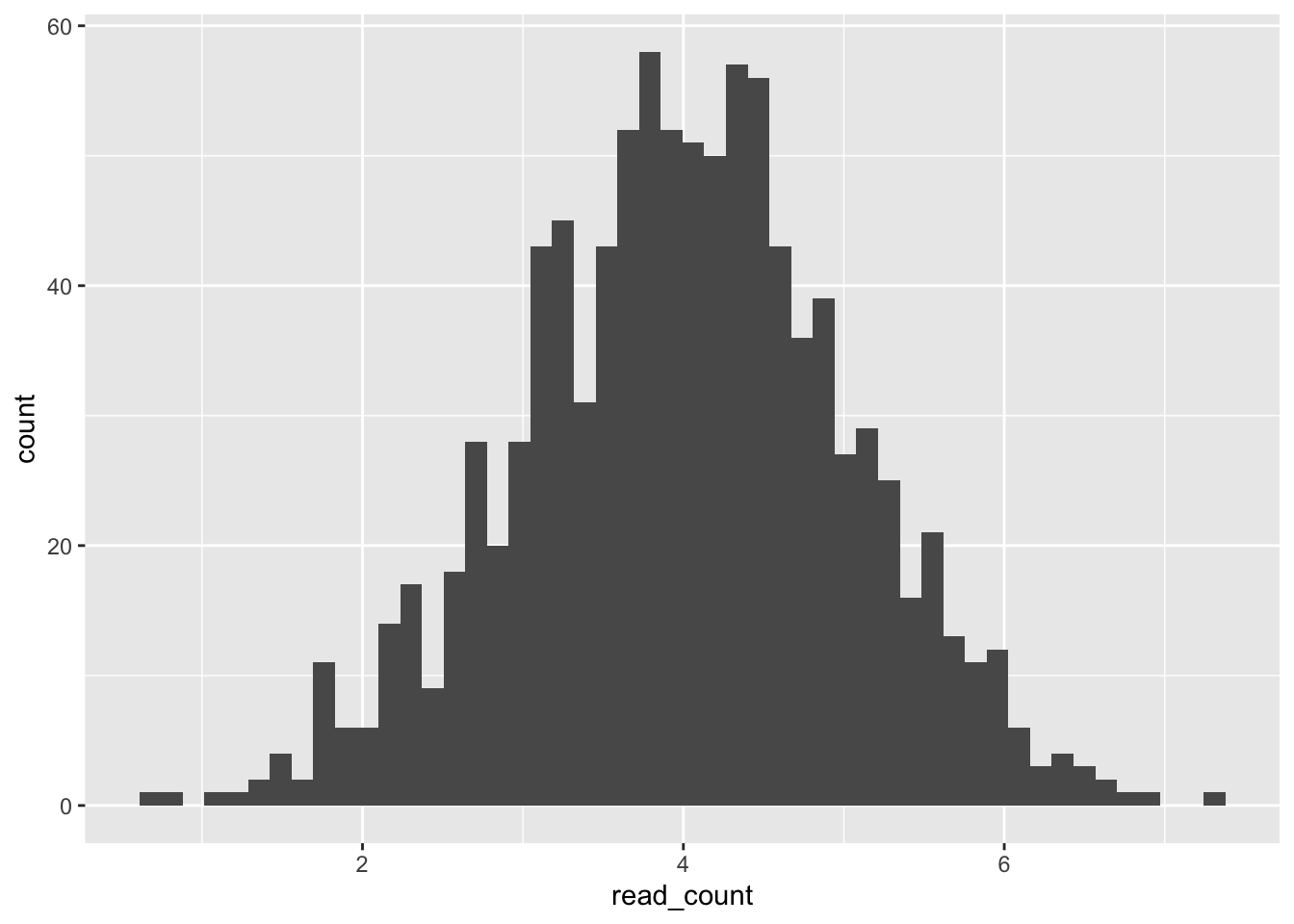
Geoms make it very easy to drastically change the type of graph generated using the same data.
ggplot(single_gene, aes(x = read_count)) +
  geom_density()
It is possible to pipe the data frame into ggplot(), creating flexible code to adjust and test variables.
tibble(condition  = "condition_a",
       read_count = rnorm(n = 1000, mean = 4, sd = 1)) %>%
  ggplot(aes(x = read_count)) +
  geom_density()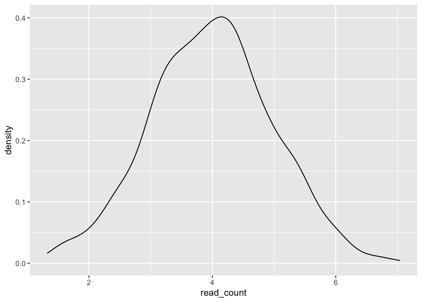
13.6 Setting random numbers
Computers are deterministic systems and, as a consequence, are bad at generating truly random numbers. Random numbers in R are randomly distributed but come in a predetermined sequence. set.seed() allows us to select a specific sequence of random numbers and makes the analysis reproducible, i.e. someone else running the analysis will receive the same random numbers and thus the same results dependent on those numbers. Repeatedly run the two commands below, and you will always receive the same plot as set.seed() restarts the sequence of random numbers (of set 212) you will receive. In contrast, if you only run the second command on its own, the distribution you will see will vary as you continuously progress in the sequence of random numbers.
set.seed(212)
tibble(read_count = rnorm(n = 1000, mean = 4, sd = 1)) %>%
  ggplot(aes(x = read_count)) +
  geom_density()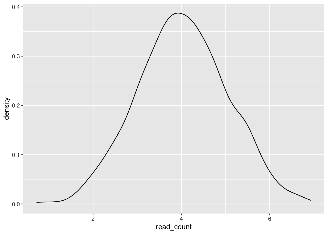
13.7 Measuring gene expression under two conditions
13.7.1 Measuring a single differentially expressed gene
Let’s assume we are measuring a gene under two conditions in which it is differentially expressed, i.e. the read_counts come from two different distributions. We can repeat each label using rep() to label each row with its corresponding condition.
# Use rep() to repeat elements
single_gene_under_a_and_b <- tibble(
  condition  =  rep(c("condition_a", "coondition_b"), each = 1000),
  read_count =  c(rnorm(n = 1000, mean = 4, sd = 1),
                  rnorm(n = 1000, mean = 8, sd = 1))
)

single_gene_under_a_and_b %>%
  ggplot(aes(x = read_count)) +
  geom_density()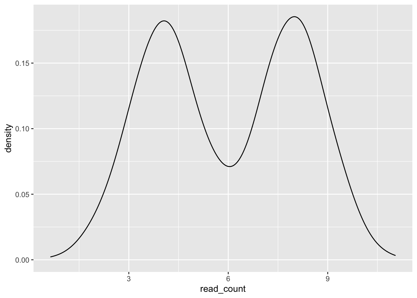
With the provided arguments, ggplot() does not distinguish our data coming from two different conditions.
13.7.2 Using the colour and/or fill aesthetic
A simple way to group our data is by providing ggplot() with an aesthetic for colouring the line (colour) or area (fill) of the geom based on a variable. In addition, we can make the overlapping part of the distributions visible by changing the opacity of the geom fill.
single_gene_under_a_and_b %>%
  ggplot(aes(x = read_count, colour = condition, fill = condition)) +
  geom_density(alpha = 0.1)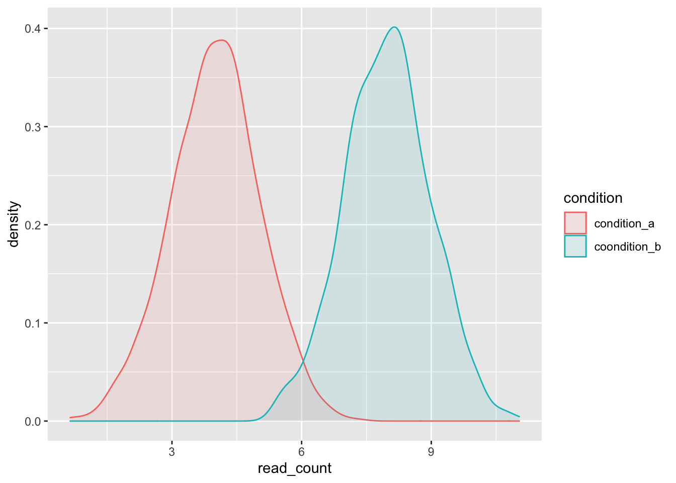
13.7.3 Testing the differential expression of a single gene
In most circumstances, it is impossible or impractical to generate many biological replicates \(n\) for each condition, and in many cases, \(n\) will be around 3–10. Let’s sample a differentially expressed gene three times under two conditions and then determine with a t-test if the difference is significant (with \(\alpha\) = 0.05). tidy() formats the results as a data frame and allows us extract the p-value.
single_gene_under_a <- rnorm(n = 3, mean = 4, sd = 1)
single_gene_under_b <- rnorm(n = 3, mean = 8, sd = 1)
result <- t.test(single_gene_under_a, single_gene_under_b)
tidy(result)$p.value
## [1] 0.009631328Now we know the result of a single gene, but how can we measure and test multiple differentially expressed genes?
13.7.4 Defining functions
Previously, you have encountered for-loops if you had to run the same code repeatedly with minor variations (for example, the input file to a command changes). This principle of avoiding repetitious code is called DRY (“Don’t Repeat Yourself”). Following the DRY principle has three advantages:
- Having fewer lines of code reduces the number of possible places for bugs.
- Maintaining code is easier because changing the for-loop will affect all iterations of the loop.
- Your code is easier to read. You need to understand a loop and its changes for each iteration once (instead of reading very similar code repeatedly). For-loops allow you to organize your code into logical units.
A different way to simplify code is by using functions. Three parts constitute a function, the <function name>, a call to function() to create the function and define its <variables>, and the body of the function in { } containing the code executed by the function. You can easily set up the general structure of a function by using RStudio’s code snippets, i.e. type fun in your script, and then one of the suggested autocompletion is fun {snippet}.
It is best to place functions at the beginning of a script after the library() calls. You can add a section header Function in your script with ctrl + shift + R. Even more flexible, you can invoke the RStudio Command Palette with ctrl(Windows)/command(Mac) + shift + Pand search for a specific command, e.g. enter section in Command Palette.
13.7.5 Using a function to perform a t-test for differentially expressed genes
Let’s write a simple function that calculates the p-value for the expression of a single gene sampled from two different distributions.
# Functions ---------------------------------------------------------------
test_differential_gene_expression <- function() {
  single_gene_under_a <- rnorm(n = 3, mean = 4, sd = 1)
  single_gene_under_b <- rnorm(n = 3, mean = 8, sd = 1)
  result <- t.test(single_gene_under_a, single_gene_under_b)
  tidy(result)$p.value
}
We can repeatedly call the same function with replicate() to simulate a data set of p-values from multiple genes (here 1000).
13.7.6 Probability distribution of differentially expressed genes
We can use a histogram to visualzie the probility distribution for differentially expressed genes.
Predict the probability distribution of differentially expressed genes. What shape do you expect (uniform, skewed, other distribution)?
p_values_for_differentially_expressed_genes %>%
  ggplot(aes(x = p.value)) +
  geom_histogram(boundary = 0, binwidth = 0.05)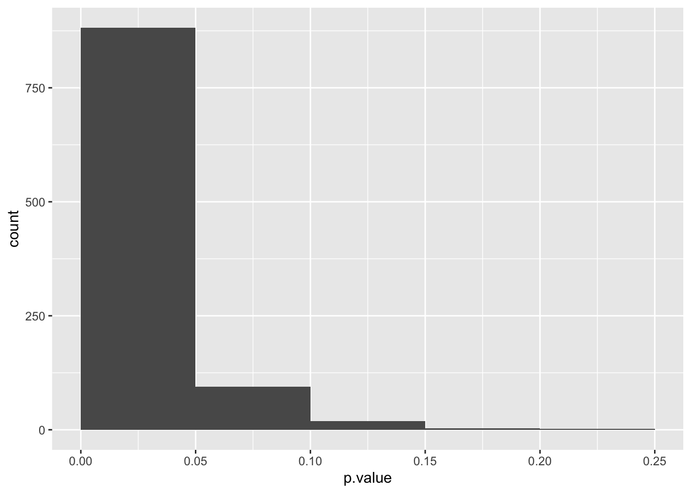
The probability distribution of differentially expressed genes is skewed toward 0. Genes with p-values between 0 and 0.5 are true positives and above 0.05 false negatives.
13.7.7 A function specifying the sampled distributions
Our current function always uses the same distributions. We can create a more flexible function by defining variables that define the two distributions we will sample from and how often.
test_differential_gene_expression <- function(n,
                                              mean_a,
                                              sd_a,
                                              mean_b,
                                              sd_b) {
  single_gene_under_a <- rnorm(n = n, mean = mean_a, sd = sd_a)
  single_gene_under_b <- rnorm(n = n, mean = mean_b, sd = sd_b)
  result <- t.test(single_gene_under_a, single_gene_under_b)
  tidy(result)$p.value
}
Finally, we can also provide default values for some or all variables with <variable> = <default value>.
test_differential_gene_expression <- function(n = 3,
                                              mean_a = 4,
                                              sd_a = 1,
                                              mean_b = 8,
                                              sd_b = 1) {
  single_gene_under_a <- rnorm(n = n, mean = mean_a, sd = sd_a)
  single_gene_under_b <- rnorm(n = n, mean = mean_b, sd = sd_b)
  result <- t.test(single_gene_under_a, single_gene_under_b)
  tidy(result)$p.value
}
Generate a data set with the p-value of 1000 non-differentially expressed genes, i.e. whose gene expression under both conditions shares the same distribution with a mean of 4, a standard deviation of 1 and 3 samples per condition. What is their probability distribution?
p_values_for_non_differentially_expressed_genes <- tibble(
  differentially_expressed = rep(FALSE, each = 1000),
  p.value = replicate(1000,
                      test_differential_gene_expression(3,
                                                        mean_a = 4, sd_a = 1,
                                                        mean_b = 4, sd_b = 1))
)

p_values_for_non_differentially_expressed_genes %>%
  ggplot(aes(x = p.value)) +
  geom_histogram(boundary = 0, binwidth = 0.05)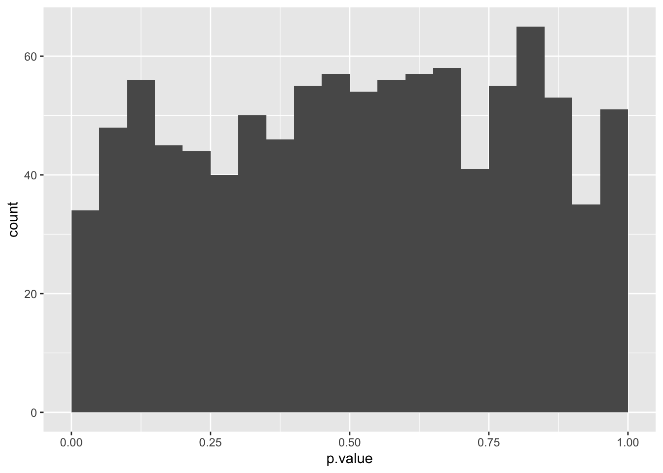
The probability distribution for non-differentially expressed genes is uniform.
13.8 Probability distributions of differentially and non-differentially expressed genes
We now have the tools to generate the p-values for differentially expressed genes (positives) or non-differentially expressed (negatives). We can now create custom data sets in which we increase the number of negatives while keeping the number of positives constant and visualize the probability distributions for the original and FDR-adjusted p-values.
13.8.1 Combining data frames
We first need to combine the data from differentially or non-differentially expressed genes. If two data frames share the same variables, we can combine their rows with bind_rows().
data_set <- bind_rows(p_values_for_non_differentially_expressed_genes,
                      p_values_for_differentially_expressed_genes)

data_set %>%
  ggplot(aes(x = p.value)) +
  geom_histogram(boundary = 0, binwidth = 0.05)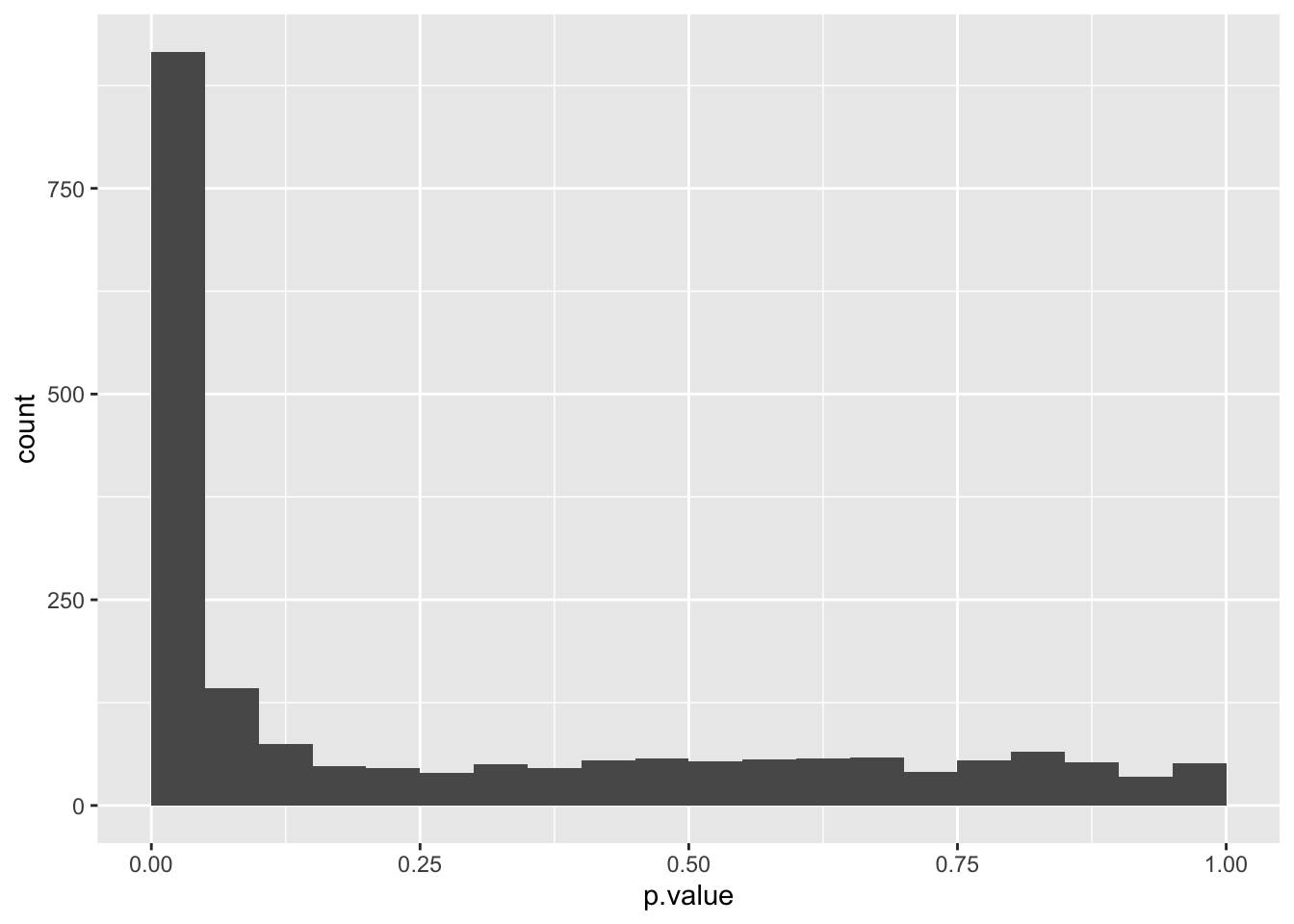
We can use an additional aesthetic, colour, to visualize the contributions of each set of genes.
data_set %>%
  ggplot(aes(x = p.value, fill = differentially_expressed)) +
  geom_histogram(boundary = 0, binwidth = 0.05)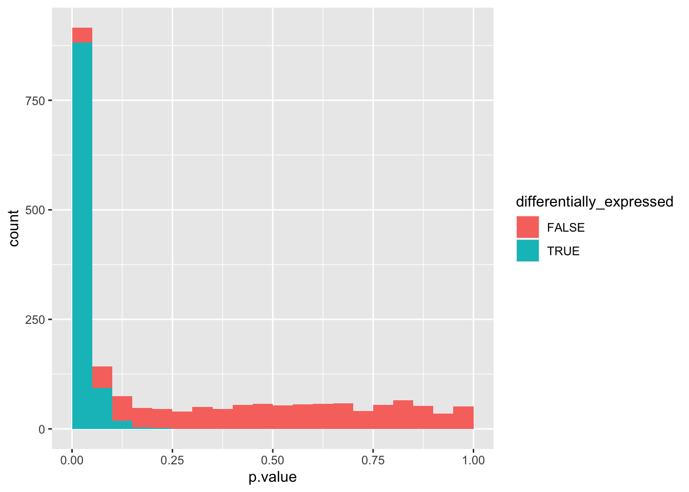
It would be helpful to see the non-differentially expressed genes at the base. Before plotting, we can convert differentially_expressed from a logical to a categorical variable with factor() and define the sequence of its possible values with the levels argument.
data_set %>%
  mutate(differentially_expressed = factor(differentially_expressed,
                                           levels = c("TRUE", "FALSE"))) %>%
  ggplot(aes(x = p.value, fill = differentially_expressed)) +
  geom_histogram(boundary = 0, binwidth = 0.05)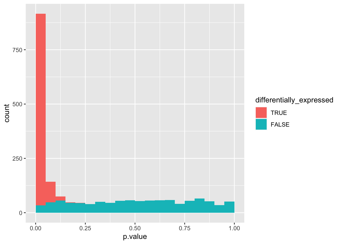
We can see that the combined probability distribution is a stacked version of the non-differentially and differentially expressed genes alone. Ideally, we would “crop” all negatives at the base to remove the false positives (i.e. non-differentially expressed genes with a p-value < 0.05). In essence, the Benjamini-Hochberg method to control the false discovery rate (FDR) attempts to do precisely that.
13.8.2 Applying Benjamini-Hochberg method to p-values
The Benjamini-Hochberg method corrects the p-values by making them larger:
Rank p-values (from smallest to largest) and start with largest.
-
Adjust p-value by taking the smaller of
-
The p-value of the next higher rank (not applicable for highest rank)
\(\operatorname{p-value}_{rank+1}\), or
\(\operatorname{p-value}_{rank} \cdot \frac{{\operatorname{total number of p-values}}}{{rank}}\)
-
The Benjamini-Hochberg method ensures that the false positives never make up more than the \(\alpha\) value of all positives (i.e. if \(\alpha\) = 0.05, then no more than 5% of all positives are false positives). At the same time, in doing so, fewer true positives are identified. Let’s calculate the FDR-corrected values with p.adjust() and visualize its probability distribution.
data_set <- data_set %>%
  mutate(p.adj = p.adjust(p.value, method = "fdr"))

data_set %>%
  mutate(differentially_expressed = factor(differentially_expressed,
                                           levels = c("TRUE", "FALSE"))) %>%
  ggplot(aes(x = p.adj, fill = differentially_expressed)) +
  geom_histogram(boundary = 0, binwidth = 0.05)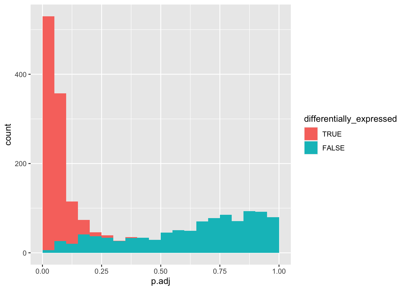
Let’s explore how increasing negatives will affect the number of true positives retained after FDR correction.
13.8.3 Function to generate data sets with varying numbers of non-differentially and differentially expressed genes
Since we will execute similar steps to generate data sets with increasing numbers of negatives (non-differentially expressed genes), this is another opportunity to define a function. In addition, we will create a variable negatives that indicates the data set (as the number of non-differentially expressed genes) and calculate the FDR-corrected p-value.
simulate_p_values_for_gene_expression <- function(
    n_differential     = 1000,
    n_non_differential = 1000) {
  p_values_for_differentially_expressed_genes <- tibble(
    negatives = n_non_differential,
    differentially_expressed = rep(TRUE, each = n_differential),
    p.value = replicate(
      n_differential,
      test_differential_gene_expression(3,
                                        mean_a = 4, sd_a = 1,
                                        mean_b = 8, sd_b = 1))
  )

  p_values_for_non_differentially_expressed_genes <- tibble(
    negatives = n_non_differential,
    differentially_expressed = rep(FALSE, each = n_non_differential),
    p.value = replicate(
      n_non_differential,
      test_differential_gene_expression(3,
                                        mean_a = 4, sd_a = 1,
                                        mean_b = 4, sd_b = 1))
  )

  bind_rows(p_values_for_non_differentially_expressed_genes,
            p_values_for_differentially_expressed_genes) %>%
    mutate(p.adj = p.adjust(p.value, method = "fdr"))
}
Let’s test if the default data set generated by our new function shows the expected pattern.
data_set <- simulate_p_values_for_gene_expression()

data_set %>%
  mutate(differentially_expressed = factor(differentially_expressed,
                                           levels = c("TRUE", "FALSE"))) %>%
  ggplot(aes(x = p.value, fill = differentially_expressed)) +
  geom_histogram(boundary = 0, binwidth = 0.05)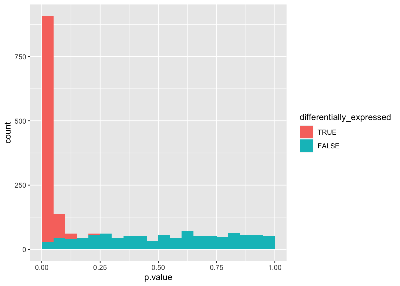
data_set %>%
  mutate(differentially_expressed = factor(differentially_expressed,
                                           levels = c("TRUE", "FALSE"))) %>%
  ggplot(aes(x = p.adj, fill = differentially_expressed)) +
  geom_histogram(boundary = 0, binwidth = 0.05)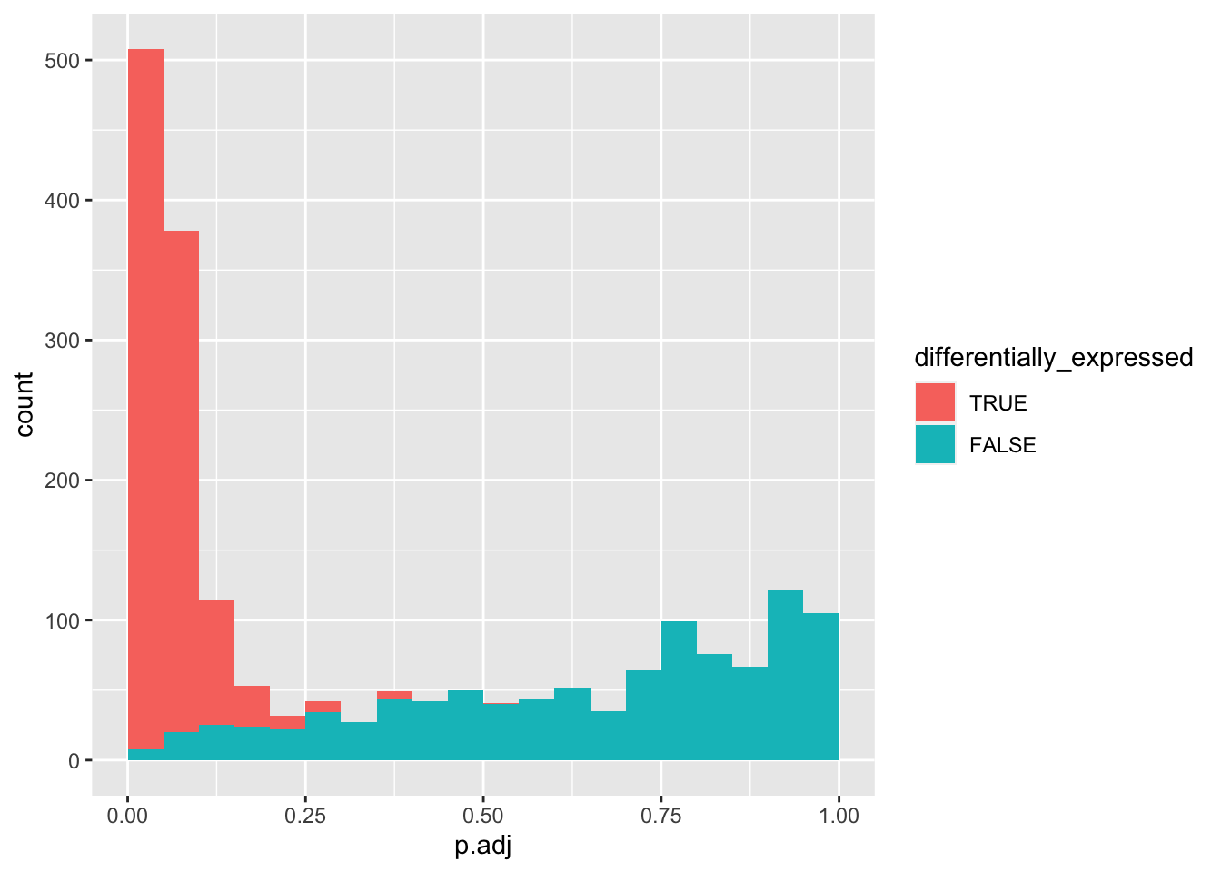
Let’s create many data sets with increasing numbers of negatives and combine them into a single one.
set.seed(212)
data_set <- bind_rows(
  simulate_p_values_for_gene_expression(n_non_differential = 1000),
  simulate_p_values_for_gene_expression(n_non_differential = 2000),
  simulate_p_values_for_gene_expression(n_non_differential = 3000),
  simulate_p_values_for_gene_expression(n_non_differential = 4000)
)
13.8.4 Faceting
If we plot this data set, we do not know the origin of each count, i.e. what subset (e.g. the set with 1000 non-differentially expressed genes).
data_set %>%
  mutate(differentially_expressed = factor(differentially_expressed,
                                           levels = c("TRUE", "FALSE"))) %>%
  ggplot(aes(x = p.value, fill = differentially_expressed)) +
  geom_histogram(boundary = 0, binwidth = 0.05)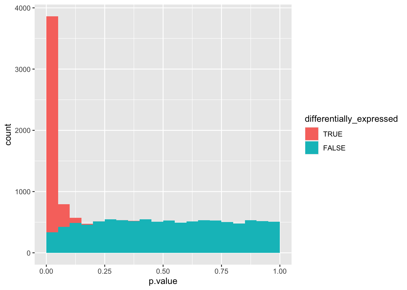
Rather than putting all data into a single plot, we can split them across panels based on categorical variables, a process called faceting. Here, we will use facet_wrap().
data_set %>%
  mutate(differentially_expressed = factor(differentially_expressed,
                                           levels = c("TRUE", "FALSE"))) %>%
  ggplot(aes(x = p.value, fill = differentially_expressed)) +
  geom_histogram(boundary = 0, binwidth = 0.05) +
  facet_wrap(vars(negatives))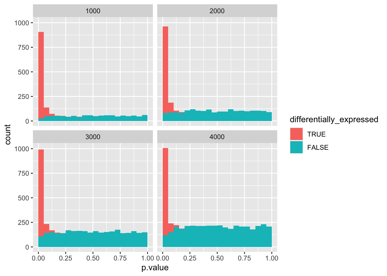
data_set %>%
  mutate(differentially_expressed = factor(differentially_expressed,
                                           levels = c("TRUE", "FALSE"))) %>%
  ggplot(aes(x = p.adj, fill = differentially_expressed)) +
  geom_histogram(boundary = 0, binwidth = 0.05) +
  facet_wrap(vars(negatives))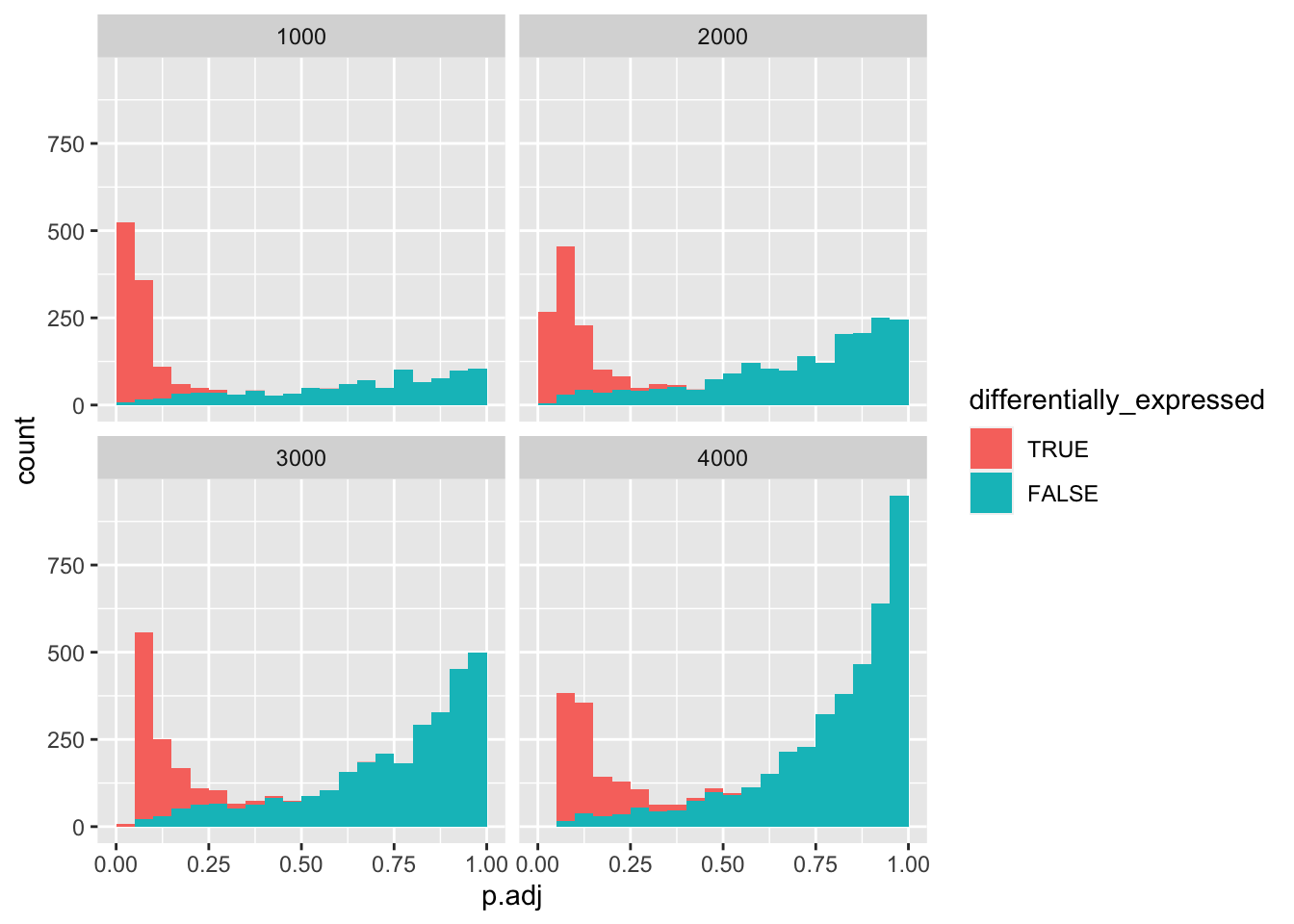
As you can see, at 4000 negatives, there are no more true positives left.
We can also plot the number of false positives vs. true positives. We can first filter for all genes with adjusted \(p < 0.5\).
We want to count how many true or false positives are in each data subset (i.e. the number of non-differentially expressed genes). Previously, we have used summarise() to determine summary statistics for an entire data frame. In our case, we want to have a summary statistic for groups in our data, i.e. for each subset and either false or true positive. We can group our data with group_by() by one or more variables.
positives <- data_set %>%
filter(p.adj < 0.05) %>%
group_by(negatives, differentially_expressed) %>%
summarise(n = n())## `summarise()` has grouped output by 'negatives'. You can override using the `.groups` argument.Finally, we can draw a line plot using geom_line().
positives %>%
  ggplot(aes(x = negatives, y = n, colour = differentially_expressed)) +
  geom_point() +
  geom_line()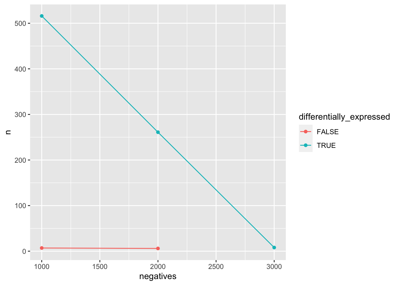
13.9 Independent filtering
To counteract the loss of so many true positives, {DESeq2} removes tests that are unlikely to show significant differences. Genes with very low counts are prone to high dispersion and fall into that category. {DESeq2} empirically determines what quantile returns the largest numbers of rejections (i.e. adjusted p-value < 0.05).
We load the Pasilla count and metadata with read_csv(). Because of {DESeq2} requirements, we need to convert the first column of each data frame to row names with column_to_rownames().
counts <- read_csv("pasilla_gene_counts.csv") %>%
  column_to_rownames("gene_id")
metadata <- read_csv("pasilla_metadata.csv") %>%
  column_to_rownames("file")
To work with {DESeq2}, we need to convert the data frame into a matrix and then use it to construct our DESeq object. Finally, we define the value of the independent variable condition representing the reference/control with relevel().
counts <- as.matrix(counts)

deseq <- DESeqDataSetFromMatrix(
  countData = counts,
  colData = metadata,
  design = ~ condition
)
## converting counts to integer mode## Warning in DESeqDataSet(se, design = design, ignoreRank): some variables in
## design formula are characters, converting to factors
deseq$condition <- relevel(deseq$condition, ref = "untreated")

deseq
## class: DESeqDataSet
## dim: 14599 7
## metadata(1): version
## assays(1): counts
## rownames(14599): 0000003 0000008 ... 0261574 0261575
## rowData names(0):
## colnames(7): treated1 treated2 ... untreated3 untreated4
## colData names(2): condition typeWe will pre-filter our data set by removing any genes with less than 10 counts across all samples to increase the processing speed.
Let’s perform the {DESeq2} model fitting and then define \(\alpha\) as 0.5 to determine our results.
{DESeq2} automatically performs independent filtering. We can extract the information from the metadata of the DESeq object.
independent_filtering_data <- metadata(deseq_results)$filterNumRej
independent_filtering_data$fitted_line <- metadata(deseq_results)$lo.fit$y
filter_threshold <- metadata(deseq_results)$filterTheta

metadata(deseq_results)$filterThreshold
## 13.57143%
## 4.890954We can use geom_point() to create a scatterplot of the number of rejects vs. quantiles. We can provide specific aesthetics to a geom instead of ggplot(), with the latter it would be used universally for all geoms.
independent_filtering_data %>%
  ggplot() +
  geom_point(aes(x = theta, y = numRej))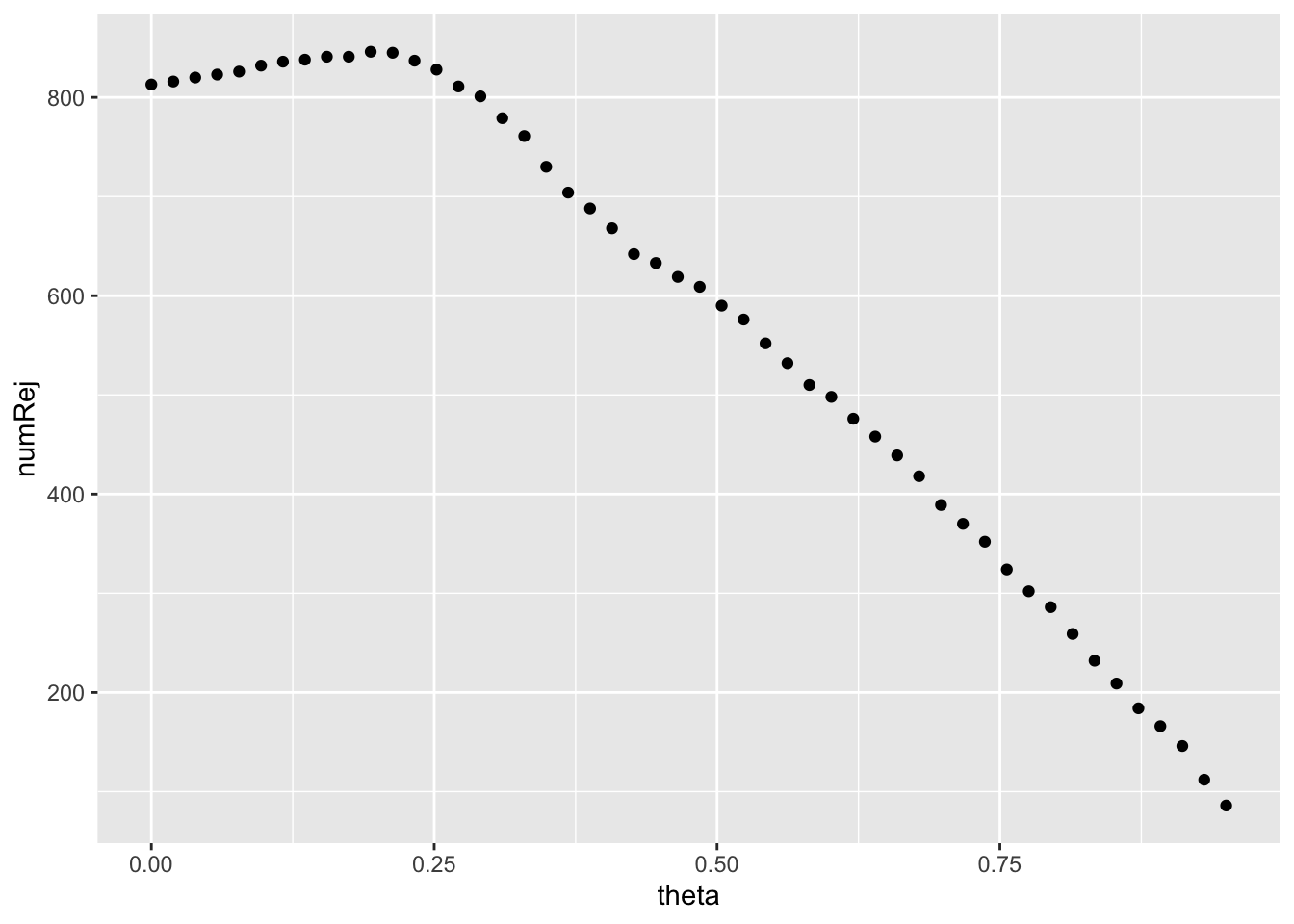
Next we can provide the fitted_line with geom_line().
independent_filtering_data %>%
  ggplot() +
  geom_point(aes(x = theta, y = numRej)) +
  geom_line(aes(x = theta, y = fitted_line), colour = "red")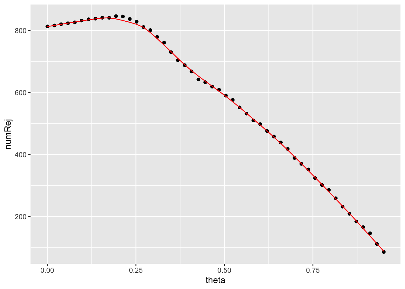
Finally, we can visualize the filter threshold that {DESeq2} has determined with a vertical line using geom_vline().
independent_filtering_data %>%
  ggplot() +
  geom_point(aes(x = theta, y = numRej)) +
  geom_line(aes(x = theta, y = fitted_line), colour = "red") +
  geom_vline(xintercept = filter_threshold)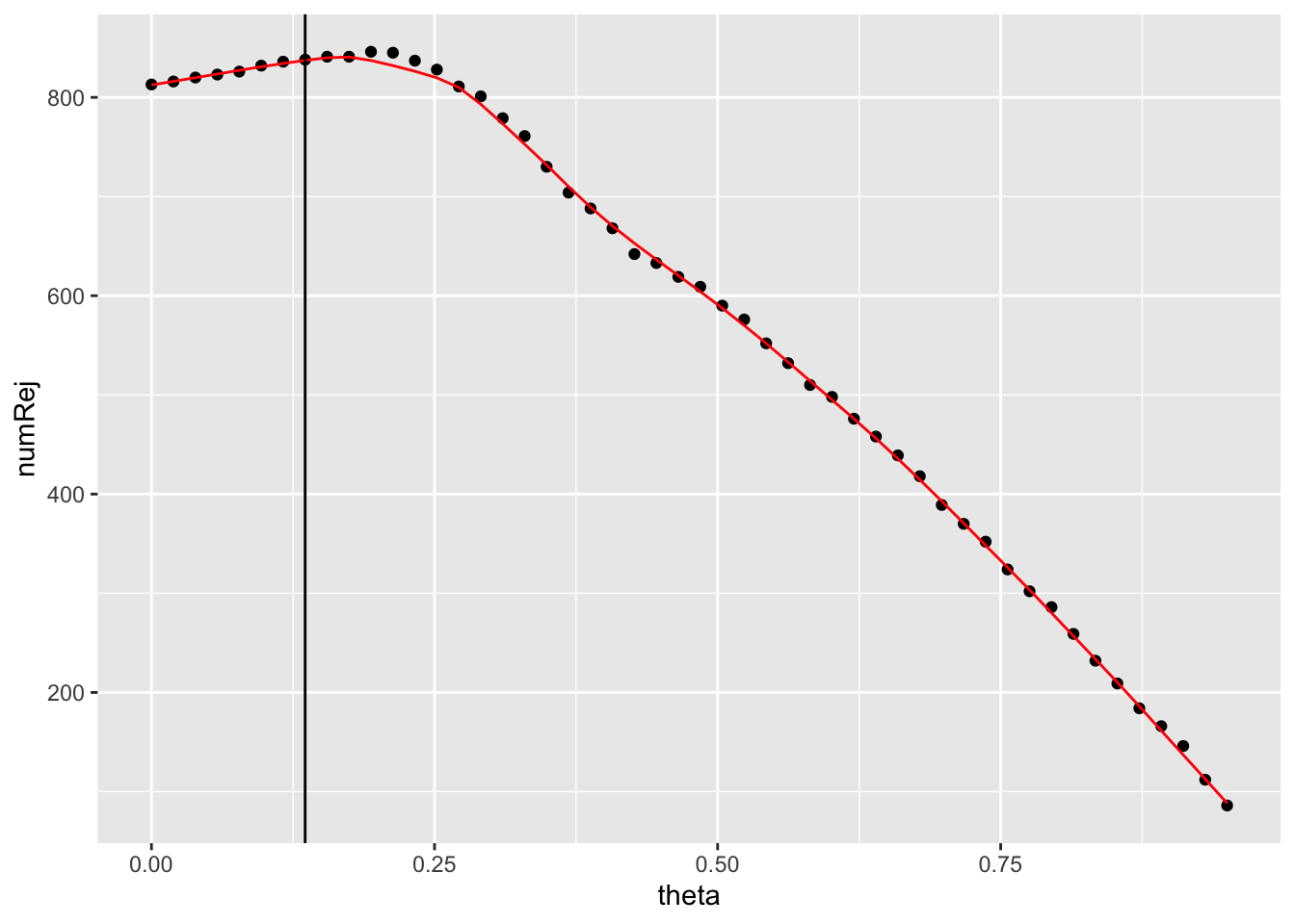
There are many options to customize a {ggplot2} plot further. You will want to add custom labels for the axes with labs() in many cases.
independent_filtering_data %>%
  ggplot() +
  geom_point(aes(x = theta, y = numRej)) +
  geom_line(aes(x = theta, y = fitted_line), colour = "red") +
  geom_vline(xintercept = filter_threshold) +
  labs(x = "significant genes",
       y = "quantile")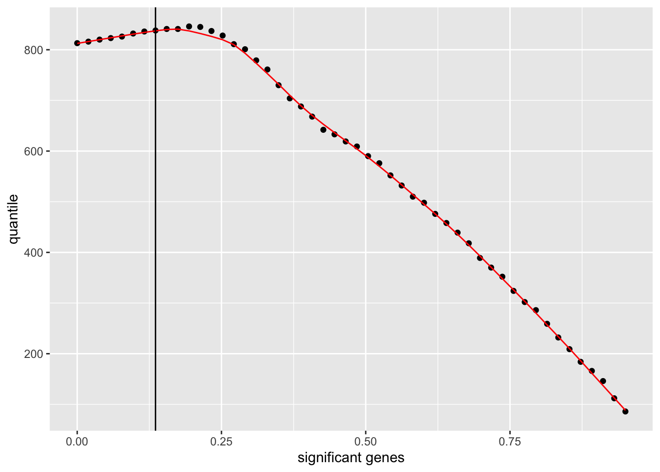
You can also modify the general look of a plot by applying a theme. {ggplot2} provides a number of default themes or you can install additional packages like {ggthemes} for more options. We will apply one of the default themes, theme_bw().
independent_filtering_data %>%
  ggplot() +
  geom_point(aes(x = theta, y = numRej)) +
  geom_line(aes(x = theta, y = fitted_line), colour = "red") +
  geom_vline(xintercept = filter_threshold) +
  labs(x = "significant genes",
       y = "quantile") +
  theme_bw()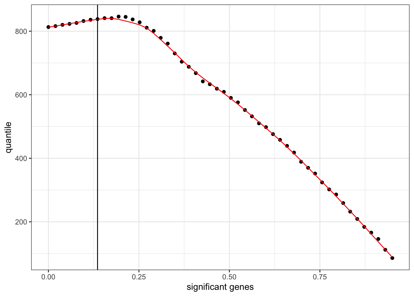
13.10 Additional resources
13.10.2 ggplot2
R cheatsheets also available in RStudio under Help > Cheatsheets